
Timeline: 6 weeks (ongoing project)
Roles: Branding Designer, Lead Graphic Designer


The Problem Space
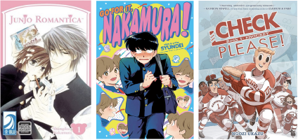
Fig. 1: Three popular Yaoi and Boys’ Love works: Junjou Romantica (Shungiku Nakamura, 2002), Go For It, Nakamura! (Syundei, 2014), and Check, Please! (Ngozi Ukazu, 2017)
Romance is a “women’s” genre. At least, that’s what every book marketing expert will tell you.
Yaoi refers to a subset of romance manga (Japanese comics) about gay male romances that are generally written by and for women. Yaoi (and its less risqué subgenre, Boys’ Love, or BL) has become mainstream since its inception in the 1970s, and the terms have become ubiquitous enough that western works in this same tradition are often ascribed the Japanese terms themselves. Despite its popularity, Yaoi is still a marginalized genre - due to both its queer subjects and female readership - and is rarely given serious academic thought.
Yaoiology answers that problem as a media analysis podcast hosted by three queer comics creators and academics. Applying both expert knowledge and fan enthusiasm, Yaoiology takes yaoi one work at a time, dissecting it for all its worth and giving it the true analytic legitimacy it deserves.
Developing the Aesthetic
As the lead branding and graphic designer, I wanted to develop a visual language for the podcast that spoke to the sensibilities of our target demographic (women and queer people) without buying into the clichés of western “romance” aesthetics - flowing scripts, pinks and reds, and a whole lot of roses and chocolates. While Yaoiology is a podcast that strives for academic legitimacy, it’s still a podcast, and therefore entertainment.
I started this process by developing a series of moodboards to find an aesthetic we could hone in on. This included gathering color palette swatches, fonts, evocative images, and tone words to drive each idea home. The five I developed were inspired by aesthetic genres that could cater to certain subsets of our demographic, which we could then broaden later.
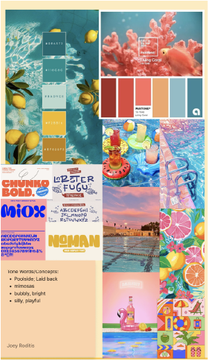
Concept 1: "Summer Coral"
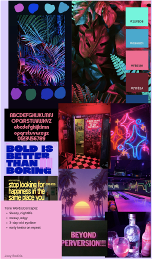
Concept 2: "Dark Neon Nightlife"
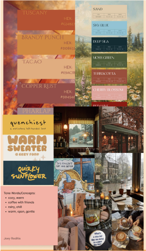
Concept 3: "Cozy Autumn"
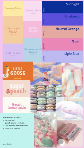
Concept 4: "Pastel Cutesy"
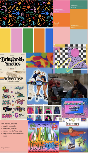
Concept 5: "Seinfeldian"
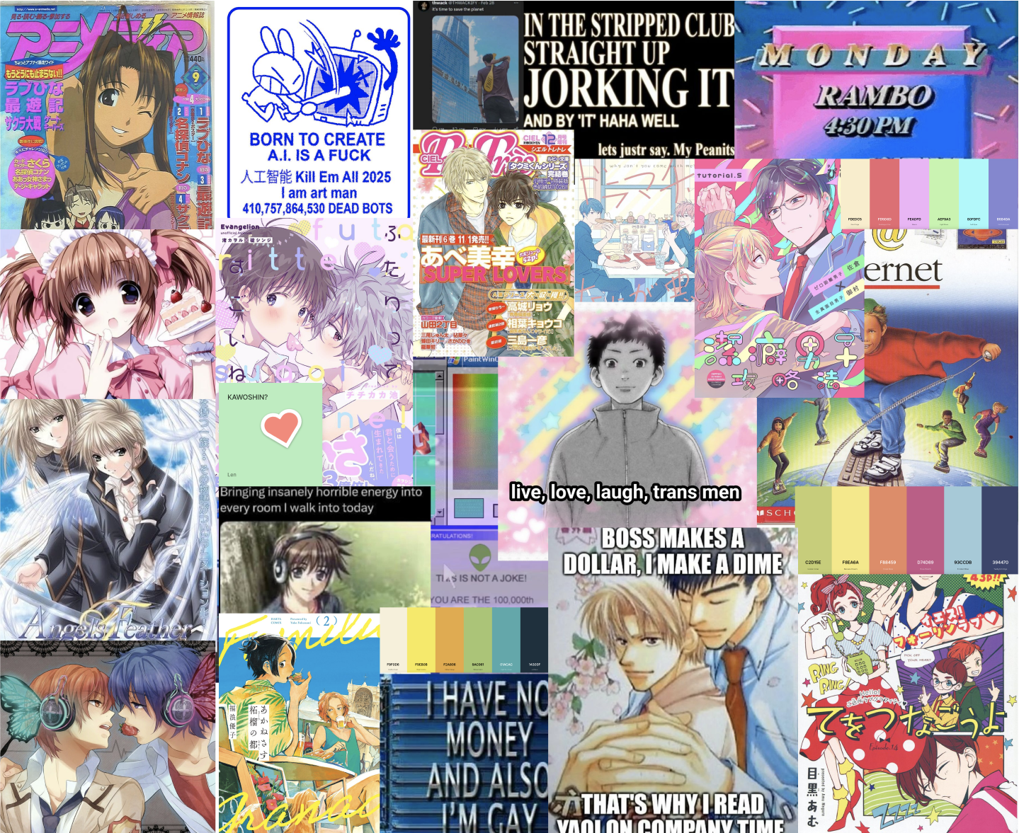
Fig. 2: The final “2000s Yaoicore” aesthetic we ended up basing the look of the brand from.
All three of the podcasts’ hosts/producers - myself included - liked the 90s-inspired Concept 5 the best, but felt it didn’t adequately capture our subject material well enough. Taking the humorous, energetic energy of the concept, I went back to the drawing board and looked to the aesthetics of yaoi itself to drive the concept instead.
Yaoi first became globally popular in the 2000s, when increased internet access and more cross-culture awareness meant more Japanese media was being imported to North America than ever before. This time period also created the “look” that Yaoi is still associated with today: large eyes and lips set on narrow faces, spiky and “over-rendered” hair, and exaggeratedly thin and long limbs and appendages. In addition to drawing from this era, I also incorporated some of the internet meme culture that surrounds Yaoi fandom, both for flavor and to make sure we were considering the sensibilities of our audience in the “look” of the brand.
Typography and Logo Lockups
Weave was, above anything else, an exercise in unapologetically wearing my passions on my sleeve and incorporating them into my design practice. Weave is a niche product: while it has many broad applications, its primary target is a very small community of online creators. However, while the community of fan creatives is small, they are also loud and dedicated. Weave is, thus, an assertion that a product can start from a niche purpose and expand on itself later.
I love fandom culture, warts and all: fandom was where I first honed my skills as a writer and artist, and set me up for the creative career I would later develop. I conceptualized this product because I see fandom culture not as a barely-exploited target market needing an insider to correctly cater to it; I see it as a thriving creative culture that is constantly transforming itself in new and imaginative ways to celebrate the works that fans build themselves around. Weave is indulgent, but it’s indulgent for the sake of other creatives.