
Well, Hello There!
If you’re seeing this, it’s because I’ve given you the link to the super-secret packaging design section of my portfolio (shhh - don’t tell anyone)! Some of this work isn’t displayed publicly at client request; others simply aren’t because they’re not yet ready to be part of a greater case study.
I hope you enjoy the work displayed on this page, and thank you taking the time today to look at my portfolio!
(Please note: this page isn’t linked anywhere on the rest of my site to maintain confidentiality of its contents. If you leave this page, you’ll have to hit that back button to return here.)

Vital Planet
Timeline: 2 Weeks
Role: Branding Designer, Packaging Designer


Vital Planet is a supplement manufacturer that recently branched into pet care; having a day job in pet supply sales, I found myself needing to overcome the… Unenthusiastic packaging to sell this as the high-quality product that it is. In response to this, my sales contact suggested I redesign some of the packaging with a more modern feel to better respond to trends that I’ve personally observed.
This project is still in progress!


Design Note:
The next steps on this design are to create some smaller decorative illustrations to go on different sides of the box and break up the composition a little more, as well as create a Feeding Direction graphic that aesthetically matches the rest of the design (ie. hand-illustrating some more cute dogs). I would also like to design a vanity UPC code, because I think they’re charming and add an extra layer of personalization to a package design.

Copy Details
(Yes, I wrote this too. The original copy was… In need of a rewrite.)


Here are some more illustrations for further redesigns I plan to tackle in the future!
(The white dog is definitely not my real life dog.)
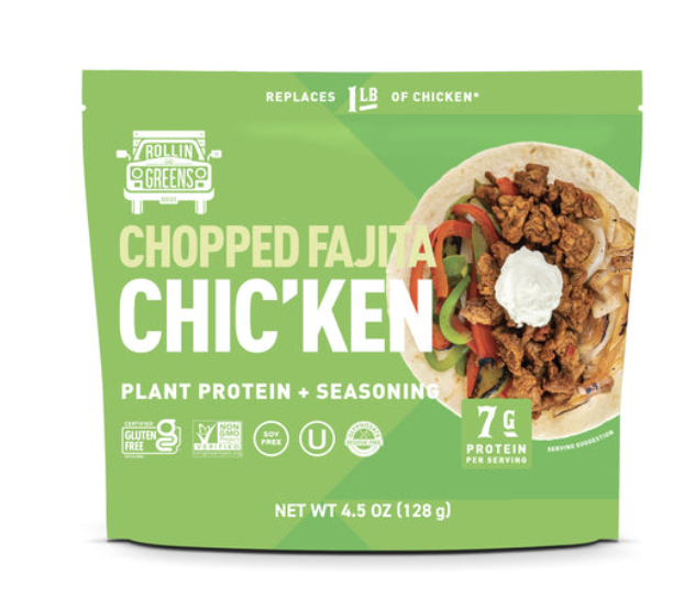
Rollin’ Greens
Timeline: 4 Weeks
Role: Creative Design Lead, Packaging Designer

Design Note:
Our biggest gripe with the design of the original bag was the use of apostrophes in the product name (ie. “m’eat”, “chic’ken”, since it obscured what the product actually was and was needlessly confusing, especially considering the original packaging doesn’t appropriately sell the product as a vegan one. We felt that using more earthy variations of the original packaging colors, as well as the incorporation of “organic-looking” illustrations of the ingredients (also done by me!) would sell this a lot better.
Rollin’ Greens is the manufacturer of a pea-protein based meal substitute for family dinners like tacos, fajitas, and whatever other vegan meals you might come up with. My classmate and I were paired with Rollin’ Greens as part of a graduate-level course at CU Boulder about designing for corporate scale, and I took over the role of Creative Design Lead in a pitch to redesign the packaging with more clarity and consumer appeal.


Wild Spring
Digital and Physical Prototypes:
(I forgot to take pictures, but I did make real soap for the prototype and it smelled awesome.)
As a final for a sustainable design course, I teamed up with a few classmates to develop a prospective sub-brand for soap manufacturer Irish Spring. As the Creative and Packaging Design Lead on the project, I directed the design of both the packaging of the soap and the display packaging with sustainability, recycling capability, and carbon-neutrality in mind.
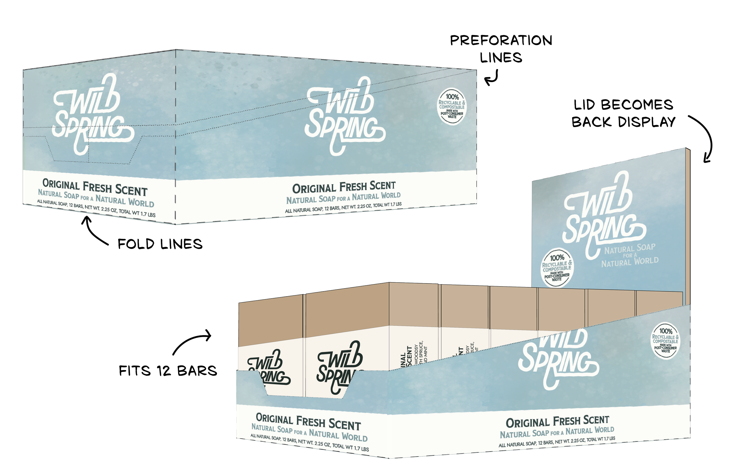

Design Note:
Looking back at this, I wish I hadn’t been so committed to a central alignment on the sides of this box, and placed the “Wild Spring” logo in a place where it wouldn’t get cut off when opened for display. However, this is what I turned in to CU Boulder, so I’m maintaining integrity by showing it in original form.

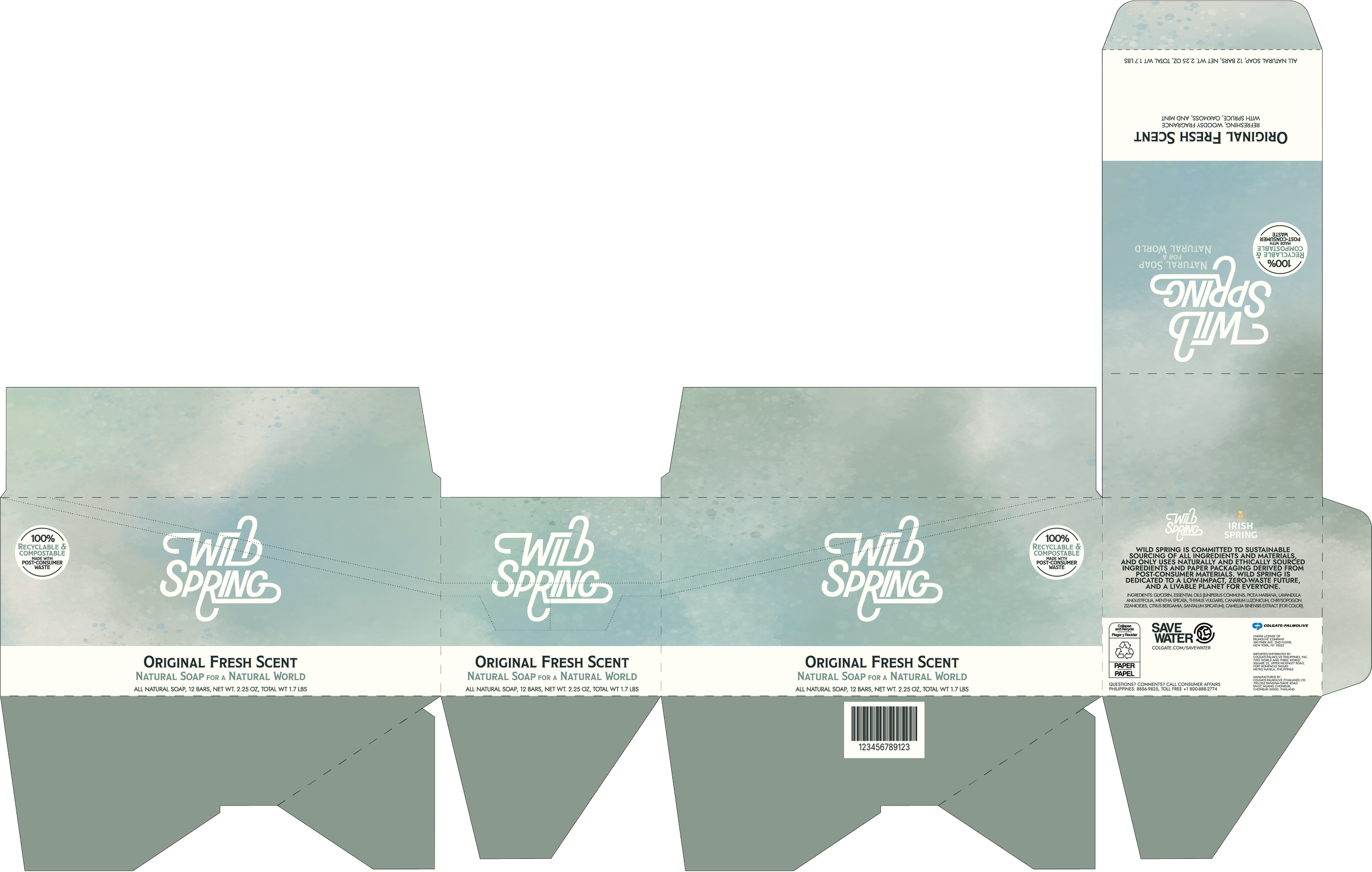
Timeline: 4 Weeks
Role: Creative Design Lead, Packaging Designer