
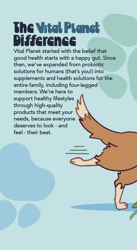
Vital Planet


Vital Planet is a supplement manufacturer that recently branched into pet care; having a day job in pet supply sales, I found myself needing to overcome the… Unenthusiastic packaging to sell this as the high-quality product that it is. In response to this, my sales contact suggested I redesign some of the packaging with a more modern feel to better respond to trends that I’ve personally observed.


Left: current packaging. Above: new concept mockup of bottle and box.

Above: box dieline. Above right: Bottle label. Right: box panel copy details. Below: additional dog illustrations for future box designs.


San Miguel Authority
for Regional Transportation
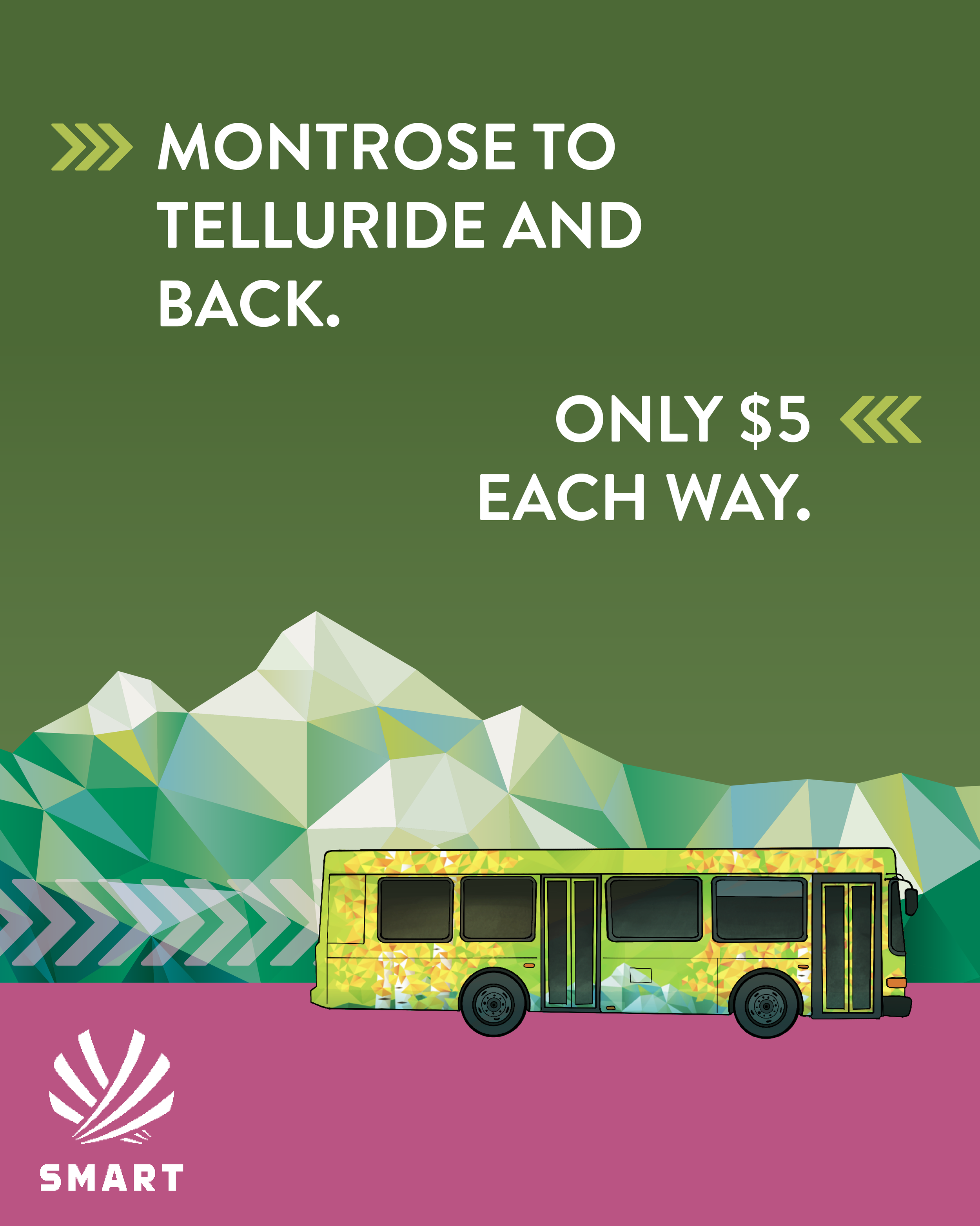
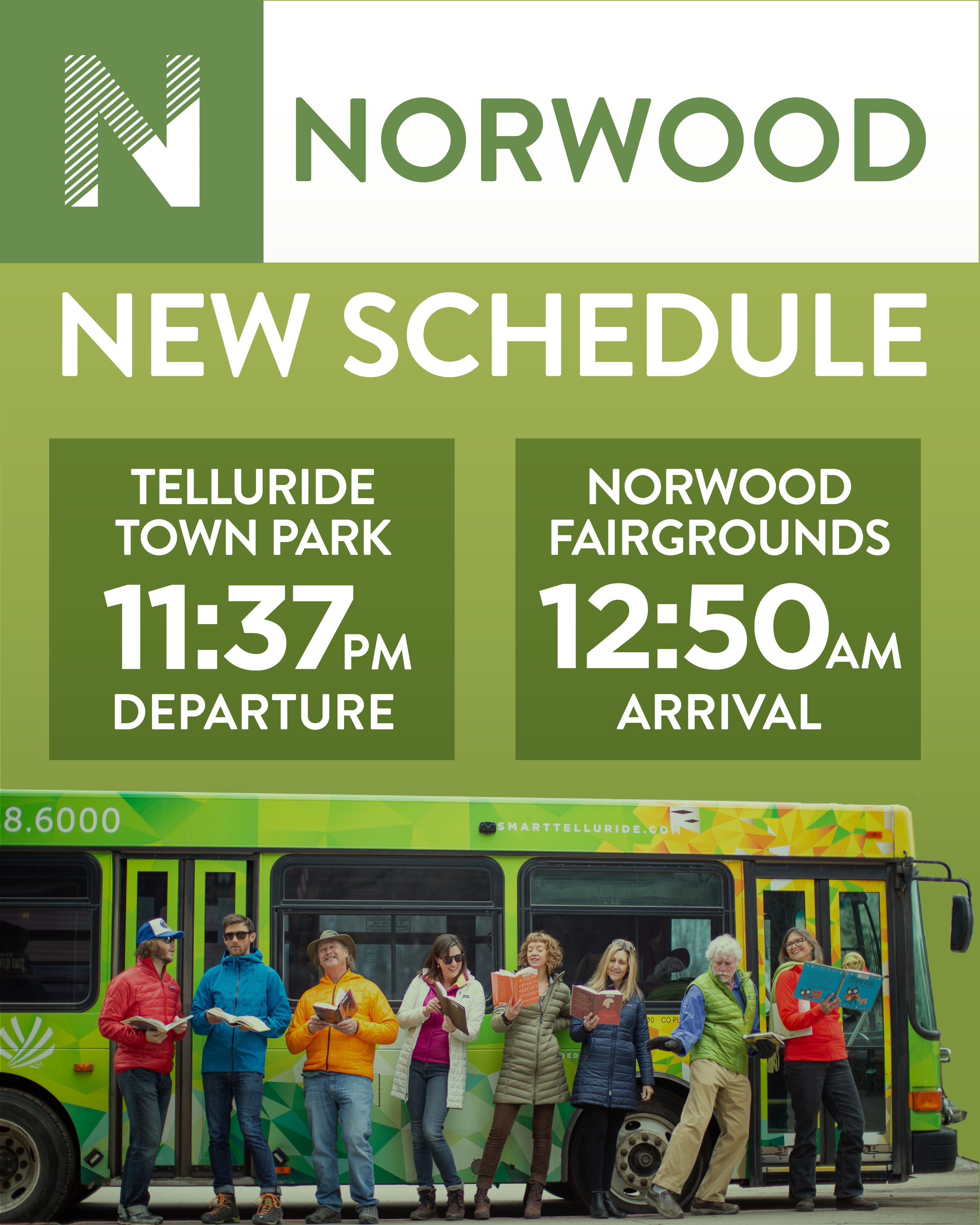


While working with Studio Six Branding, I was assigned to make social media posts for one of our regular clients, SMART (San Miguel Authority for Regional Transportation), a regional bus system in San Miguel County, CO, that mostly serves workers commuting into the county seat and ski destination of Telluride. SMART’s branding emphasized safety and economic values to reflect their ridership, which I often imbued with a playful feel to give the posts life and encourage engagement.
Above left: a selection of planned posts for the official SMART Instagram account. Above: vertical promotional videos for SMART’s Instagram story and Instagram Reels page.


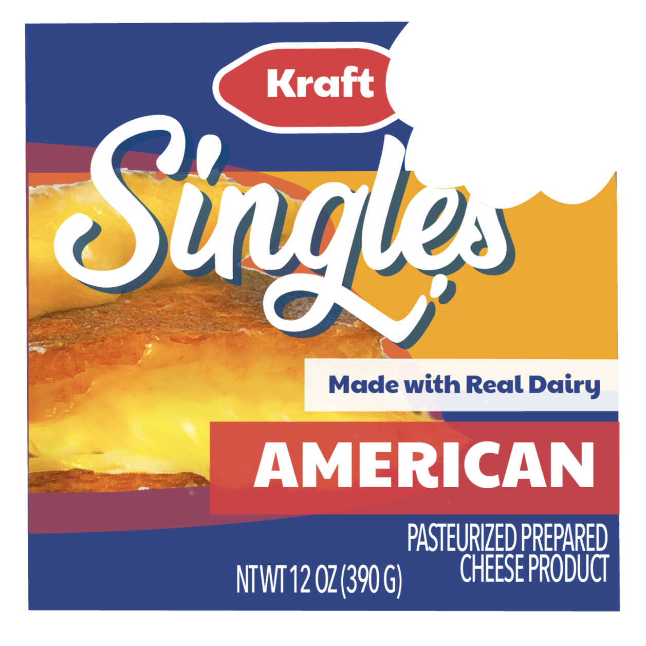
Kraft Singles
Early in grad school, I chose to rebrand Kraft Singles as part of a ‘brand rehab’ project. I looked to fashion-forward food and beverage brands like Arizona Tea for inspiration to rebrand Kraft Singles as a playful, trendy, and energetic brand with an offbeat sense of humor, and a bite-mark motif to tie the whole thing together.


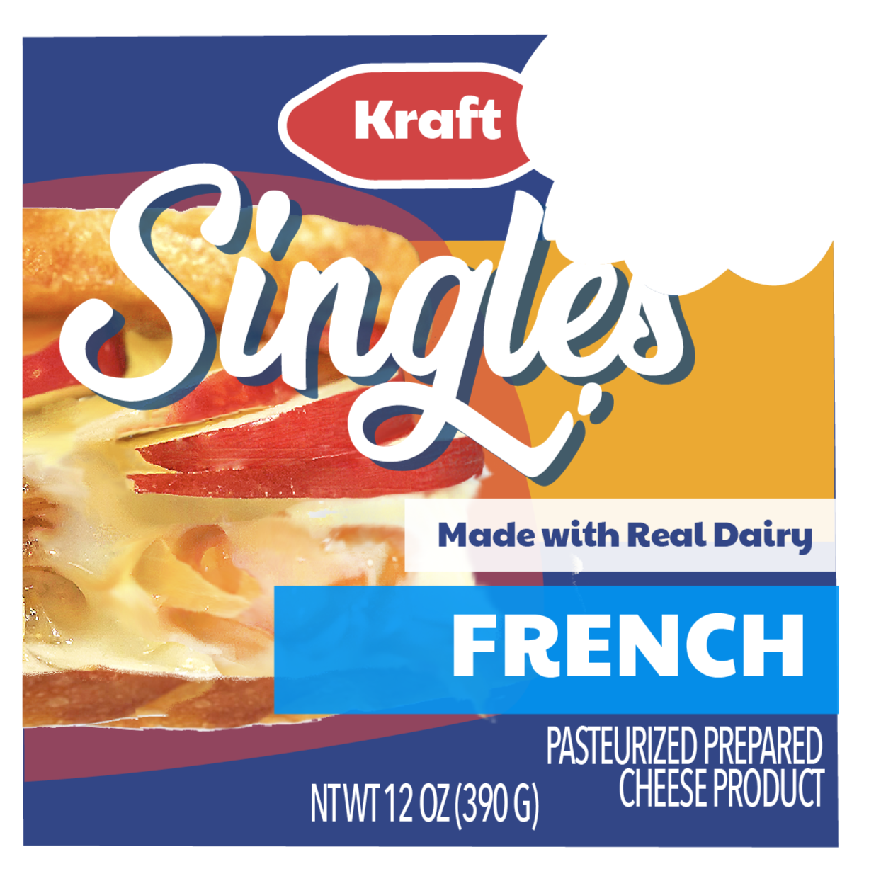

Clockwise from top left: packaging key promotion image; magazine spread ad; horizontal webpage banner ad; front panels of new packaging; hoodie mockup and back design.