

Timeline: 3 Weeks
Project Role: Art Director, Concept Artist


The Brief

Tucked away just two asteroids to the left of the edge of our universe is a diner serving up American classics in a cozy atmosphere. Welcome to Glorp’s: The Last Diner Before the Void!
Glorp’s is an immersive dining experience linking classic Americana diner vibes with the wild and wacky world of outer space. In the same vein of interactive dining experiences like Meow Wolf’s Sips with a Z or Walt Disney Resort’s Space 220, Glorp’s seeks to merge classic comfort with the excitement of space exploration for intrepid astronauts of all ages.
Creating Glorp


Fig. 1 and 2: the original Glorp meme, as well as the initial plush toy concept art.
While the original concept was funny, it was clear from this point that Glorp’s Diner would sell best with a true mascot leading the brand. As the Art Director on this project, I took it upon myself to explore this direction further. I started by consulting some of the moodboard imagery the team built early in the development process for inspiration for the mascot. We wanted to have clear callbacks to mascots like Big Boy, with elements of later mascots like Garfield and more modern “cutesy” art.

Fig. 4, 5, 6: Glorp Key Art. Clockwise from above: Glorp’s full-body illustrative form, several outfit tests for alternate styling, and an early form of the logo, displaying the cropped key art.

The name “Glorp” allegedly came in a dream from the Design Lead on this project; when the entire team searched the name ‘Glorp’ to see what might come up, we found this image of a kitten that’s been heavily edited to appear more “alien” through being shaded green and given antennae. Through a few jokes back and forth about creating an “ugly-cute” plush toy based on the design, meant to be placed in a theoretical claw machine.
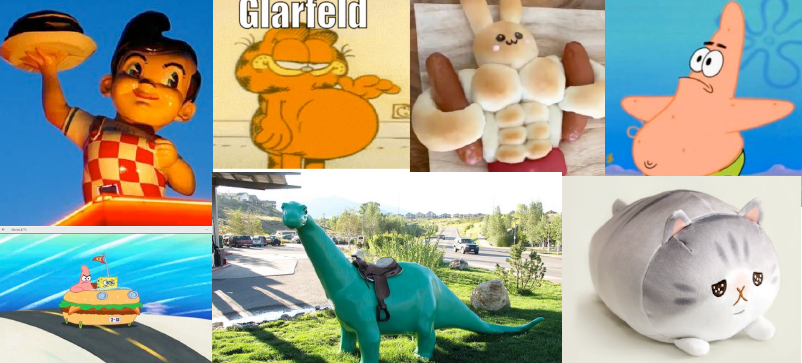
Fig. 3: moodboard for mascot creation. Clockwise from top left: Big Boy, Garfield, a bunny-shaped hotdog bread loaf, Patrick Star, Crying Cat plush, the Sinclair Dinosaur, and Spongebob and Patrick driving in the Krusty Krab Mobile.
My first draft of Glorp’s design is what became his final iteration, and, true to his source material, we chose to keep his design as a cute little alien kitten. Drawing inspiration from Spongebob Squarepants and Big Boy, we decided to display him holding up a burger as the key action pose, and giving him roller skates to allow for more interesting poses.
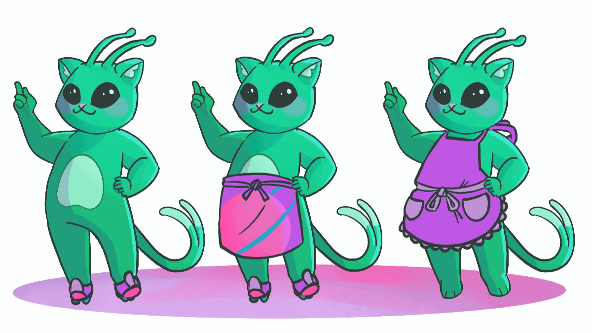
While we did play with the possibility of dressing him in a little more than just roller skates (below), we ultimately felt that, since only his head would usually be displayed, it would add too much complexity to the design.
Creating the Diner

Fig. 7: Diner moodboard, including photos from various Meow Wolf locations, the diner from Twin Peaks, and Edward Hopper’s Nighthawks.
As the concept artist on the project, I personally took inspiration from the Star Wars: Galaxy’s Edge theme park’s environmental design (aka Disney’s Star Wars Land), as well as Shonen Jump’s sci-fi/horror/rom-com series Dandadan.


Fig. 9, 10: completed concept illustration of the interior of Glorp’s diner, plus an in-progress shot showing the reference sketch and a human for scale.
Given the mid-century American Diner theme of the establishment, we looked to both 50’s-style diners and our competitors of Meow Wolf and Disneyland for inspiration. The entire team kept calling back to key pieces of American media featuring the strange and paranormal, such as The X-Files and Twin Peaks, as well as UFO sighting hotspots like Roswell, New Mexico, so we folded elements of their narratives and storytelling style into the brand and interior styling.

Fig. 8: Key concept art from the development stage of Star Wars: Galaxy’s Edge, as well as several pages from the manga Dandadan.
In order to thread the line between the outer space and diner theme, we chose to approach the interior design from a root aesthetic of 50’s Atomic Futurism.
We paired the bright colors already present throughout the brand with heavy chrome accents, and used curved crown molding and archways to soften corners and give a more “spaceship-like” feel. The inset booths are much darker than the rest of the diner and would have inset LED screens displaying an outer space vista, evoking a feeling of being inside a space station from the comfort of a diner booth. Misshapen tables, egg-shape chairs, and a hip statement chandelier tie the retro-futuristic look together, inviting diners to an establishment that’s completely out of this world.
Glorpin’ In Style

Glorp’s branded mugs and stickers.
When I design merchandise like apparel or accessories, I like to ask not only what my end user might want to buy, but myself as well: I have been a compulsive merch buyer for most of my life, so unfortunately, I am also the ideal audience for this market.
I love incorporating unconventional or cool branding into my style, so I approached this challenge by asking myself what I would want to wear. Taking from modern trends of t-shirt designs with small left breast designs and large, elaborate back designs, I extrapolated on the cropped version of Glorp to reimagine him driving a UFO.
To round out the theme of “diner-themed merch”, I wanted to round the line out with a drink tumbler. “Big Glorp”, a play on the 7/11 Big Gulp, came in a flash of inspiration, playing into a staple of American road trip culture with a humorous edge.


Fig. 13, 14: Glorp’s branded hoodie and travel mug.

Let’s be clear: theme parks are for selling tie-in merch. Disney has perfected this business model, but even as a more level competitor, Meow Wolf’s merchandising game is nothing to sneeze at. In order to stick the landing and sell this brand, we really felt like we had to deliver merchandise that people would want to purchase for themselves.
We started our merchandise development by conceptualizing what would be both most accessible, and most desirable by attendees. Our first instinct, naturally, was a mug, followed by stickers. We explored multiple shapes for our mugs, including traditional, straight-sided 10oz mugs and the iconic concave mugs of Waffle House, before settling on these retro-futuristic mugs with seamless handles.
Takeaways

Fig. 15: Glorp’s hoodie key art.
Glorp’s was, ultimately, a joyful exploration of a field of design I never thought I’d be interested in: theme park and themed experience design. Theme parks have always been something of an enigma to me, having an appeal I could implicitly understand but struggled to buy into. Having the permission to insert my personal voice into this field gave me a new appreciation for themed design because I was able to approach it from a personal, empathetic level, thus creating a better understanding of how to breach the gap between user and experience.
Also, I had fun making merch.
Team Credits
Art Director: Joey Roditis - Design Lead: Juliet Margulies - User Experience Lead: Brian Barraza - Marketing Director: Alexandra Susann