
Hi, I’m Joey!
This is my portfolio for the 2026 Brand Design Fellowship with Chronicle Books.
I hope you enjoy my work!

Bookmarkd
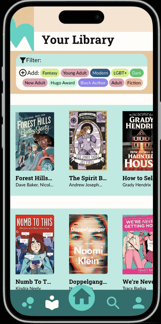
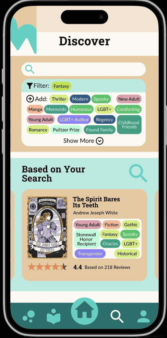
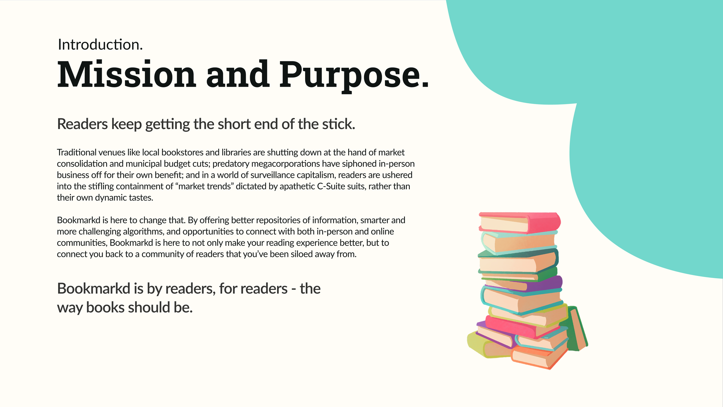
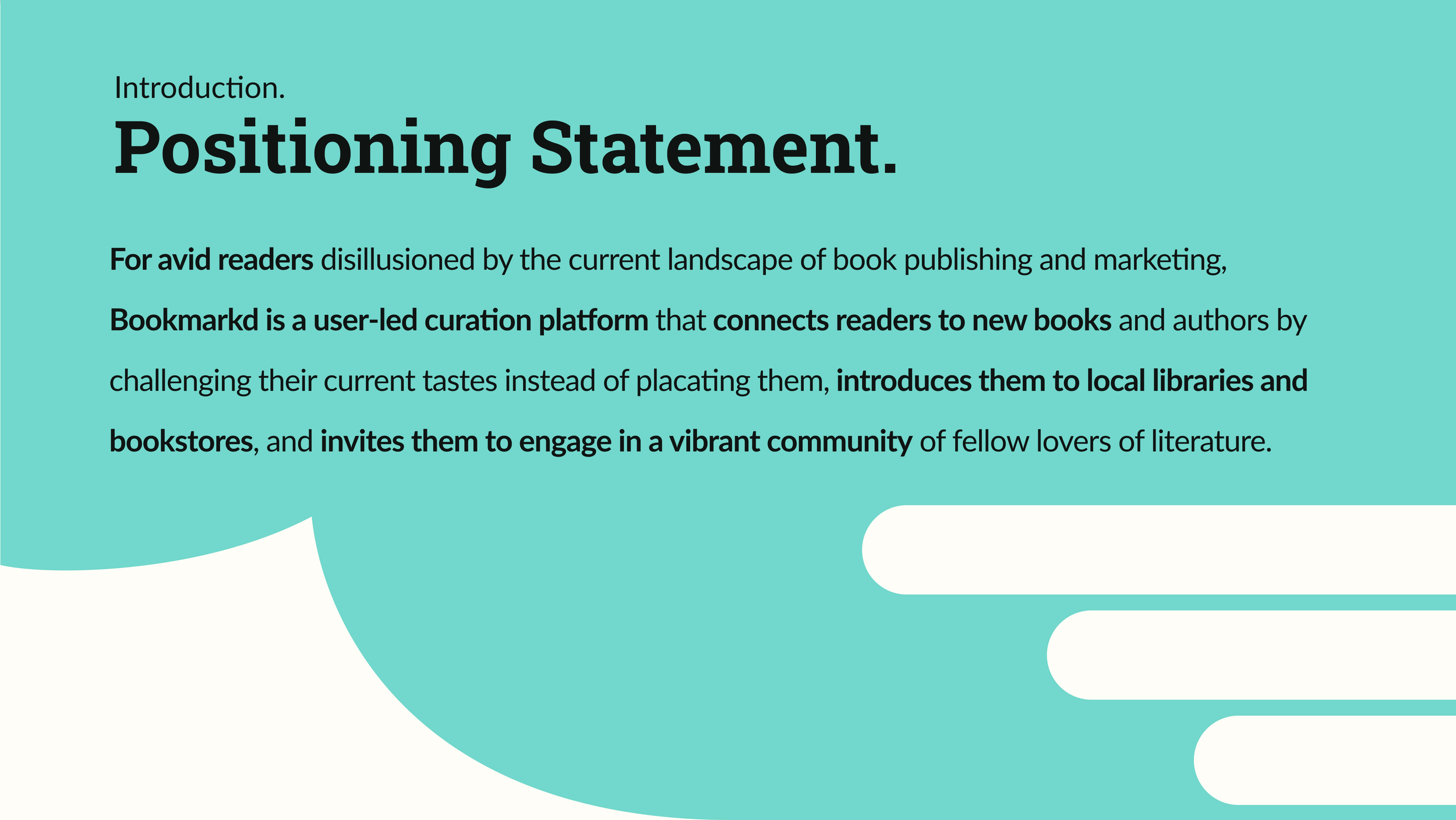
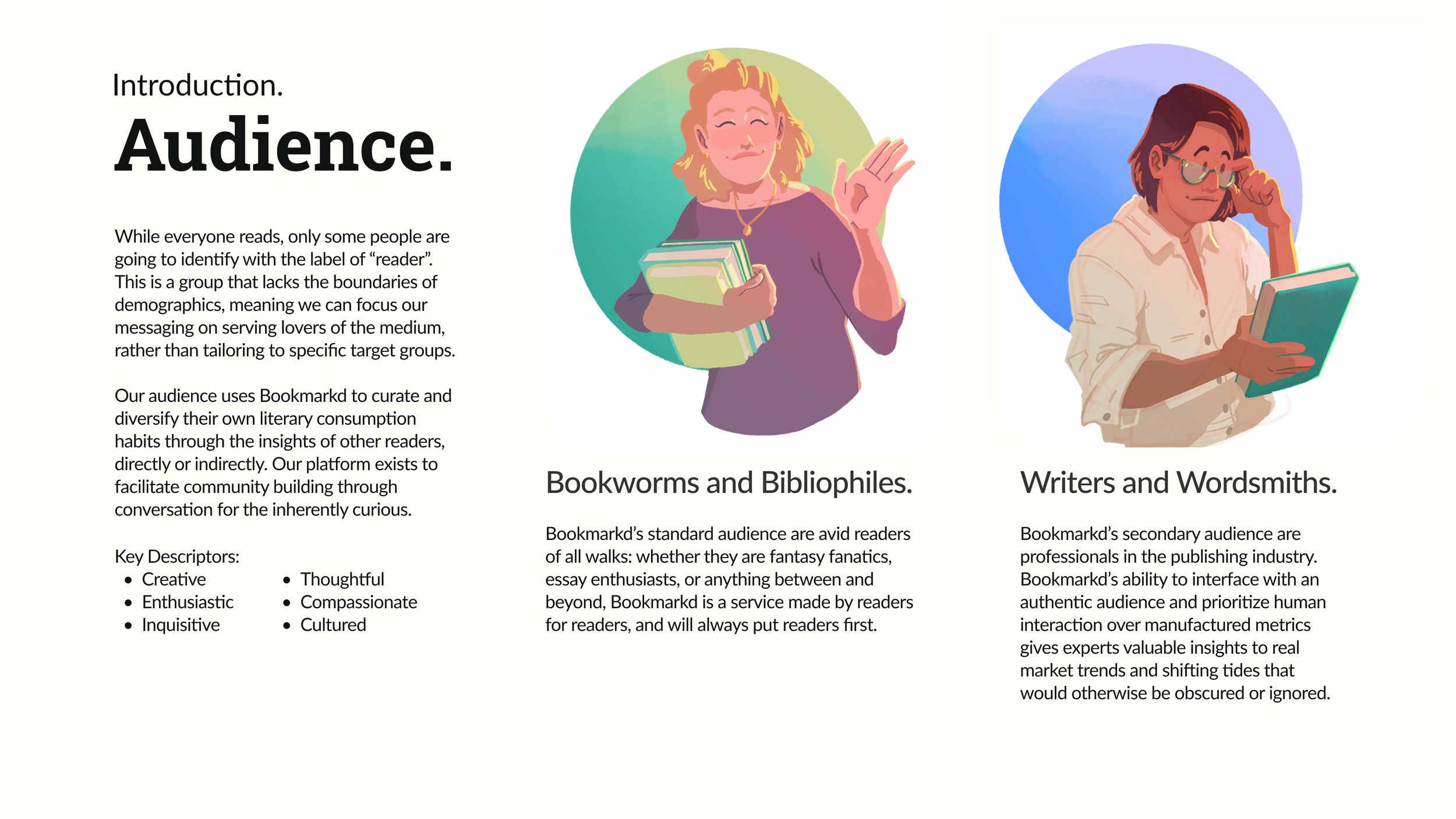
I love books, and that love led me to the traditional publishing industry as an illustrator for graphic novels. It has also driven me to find solutions for modern shortcomings of book sales and marketing that I’ve observed. When given an opportunity to spend a whole semester building a brand and product, I used that passion to make Bookmarkd: a user-led book review and catalogue platform with a mission to challenge readers to expand their tastes and discover their new favorite book they’d otherwise never find.
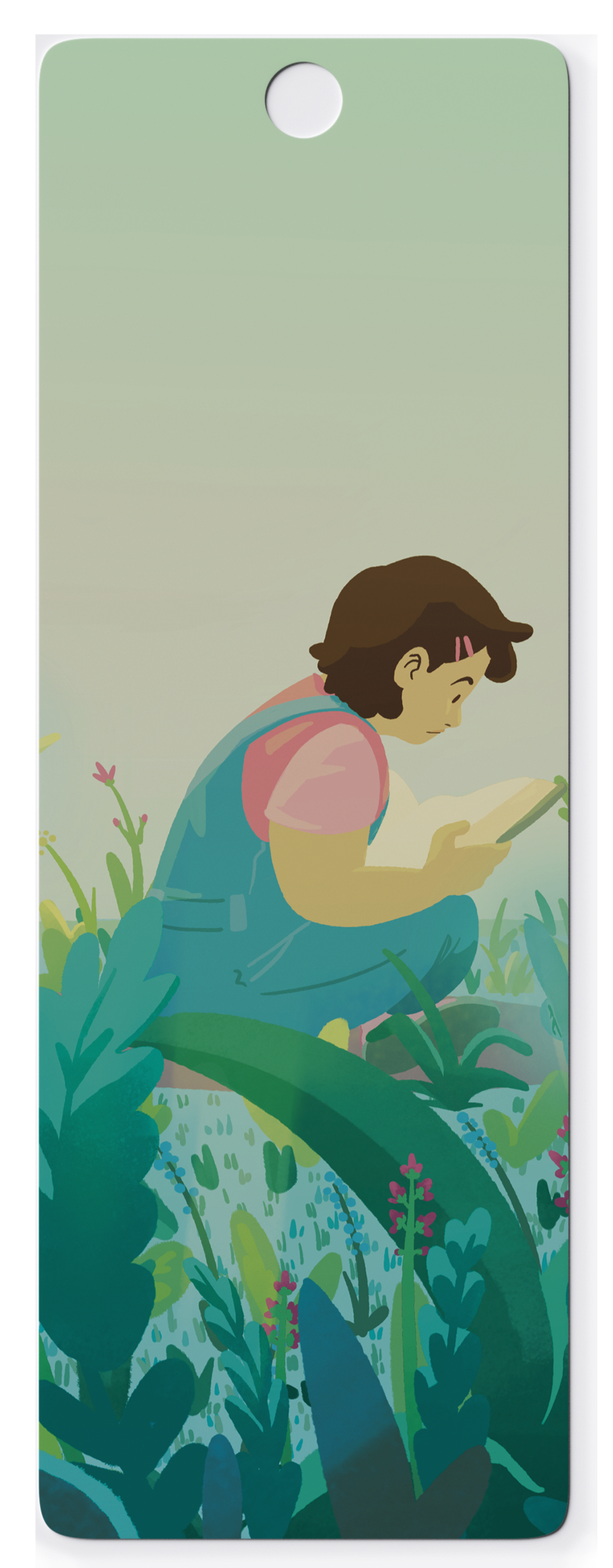
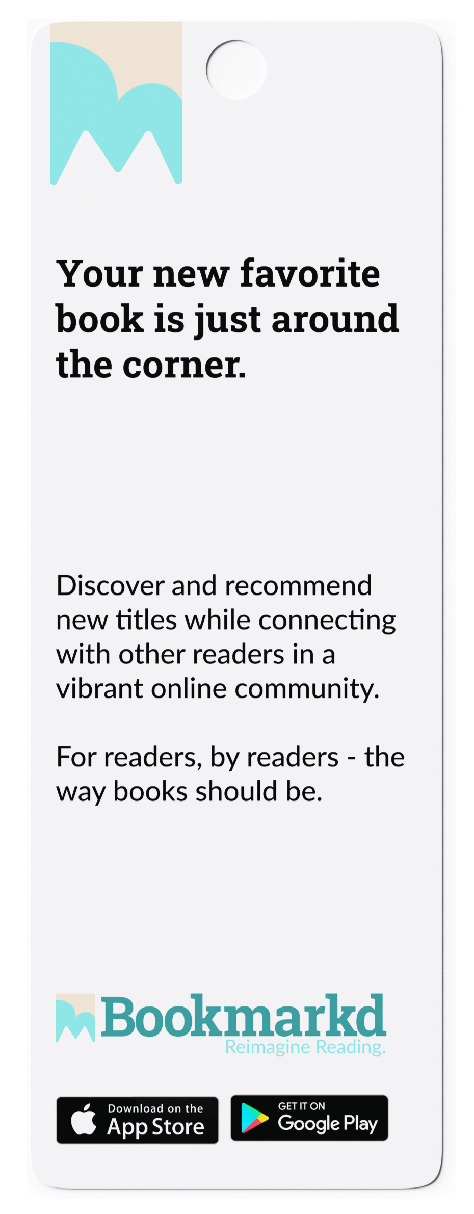
Promotional bookmark for Bookmarkd.

Early wireframes of the Bookmarkd interface in Figma.


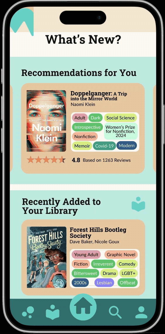
Product demonstrations of the Bookmarkd platform prototype.

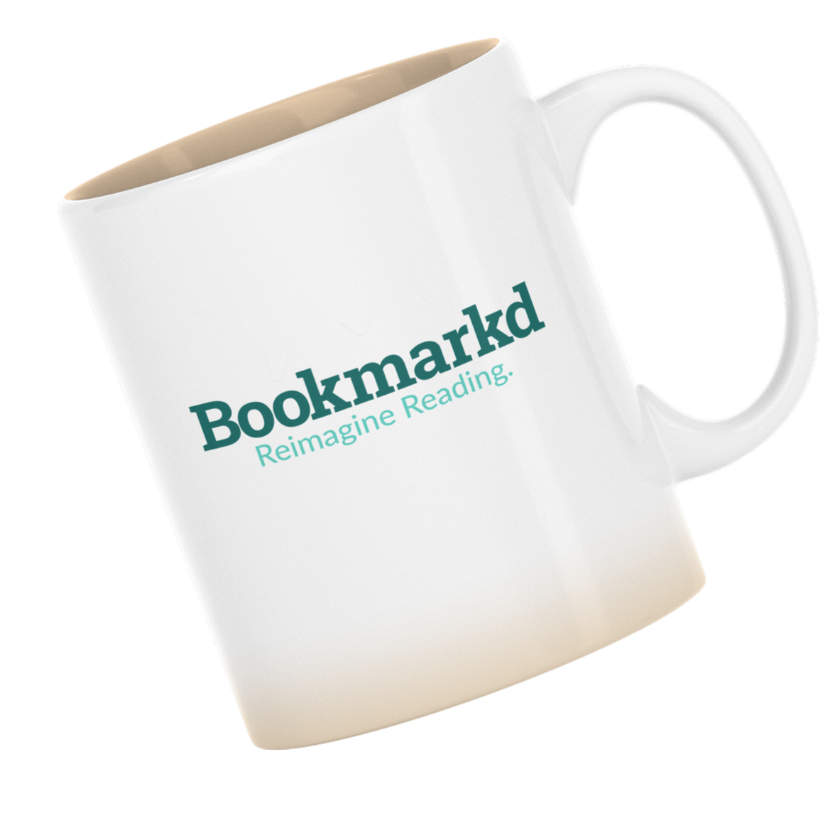
Above: tie-in merchandise for Bookmarkd, as pocket tee, mug, and tote bag.
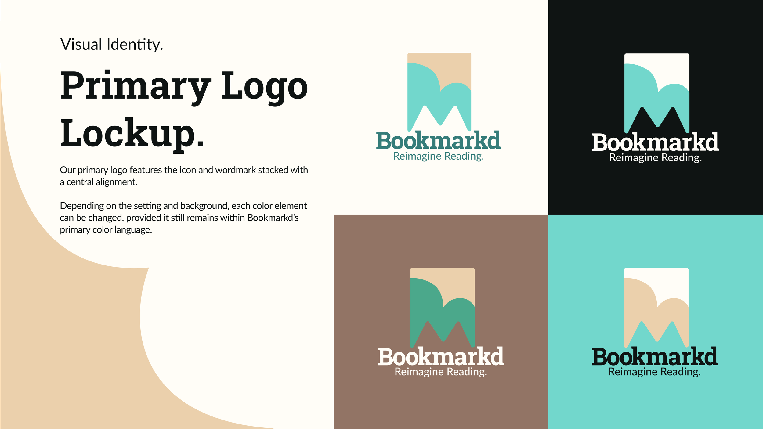
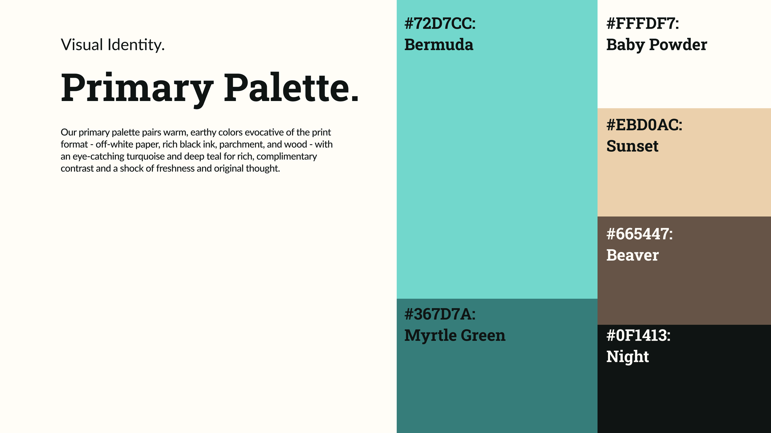
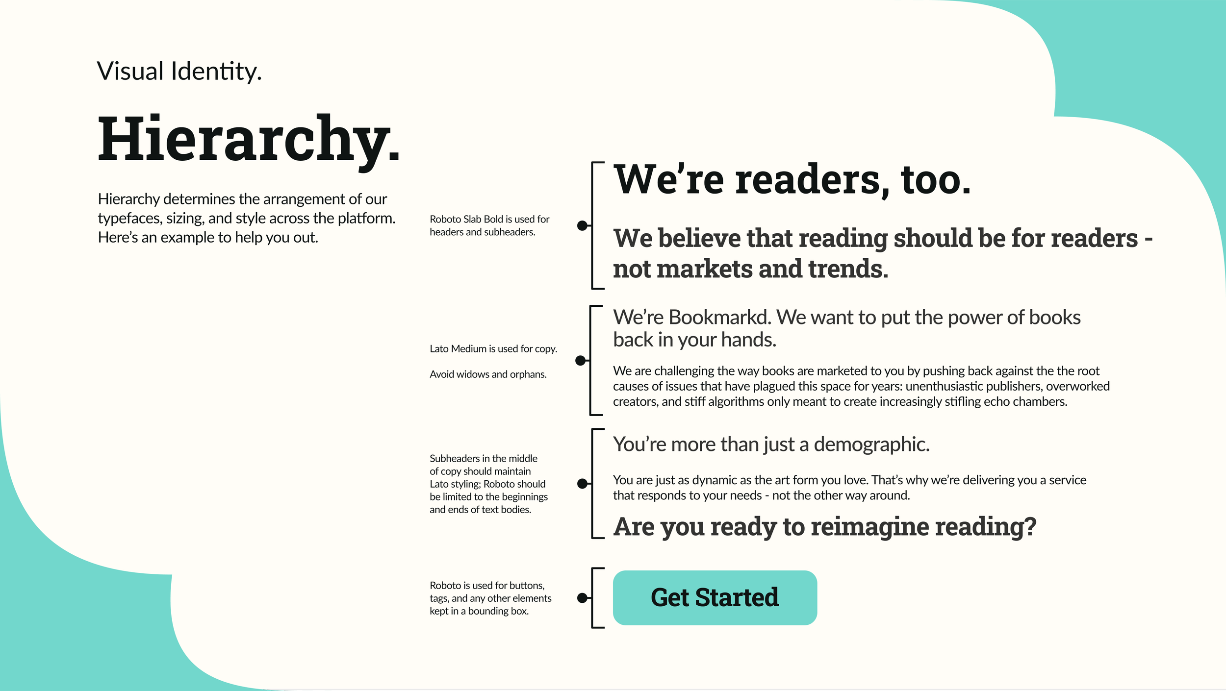
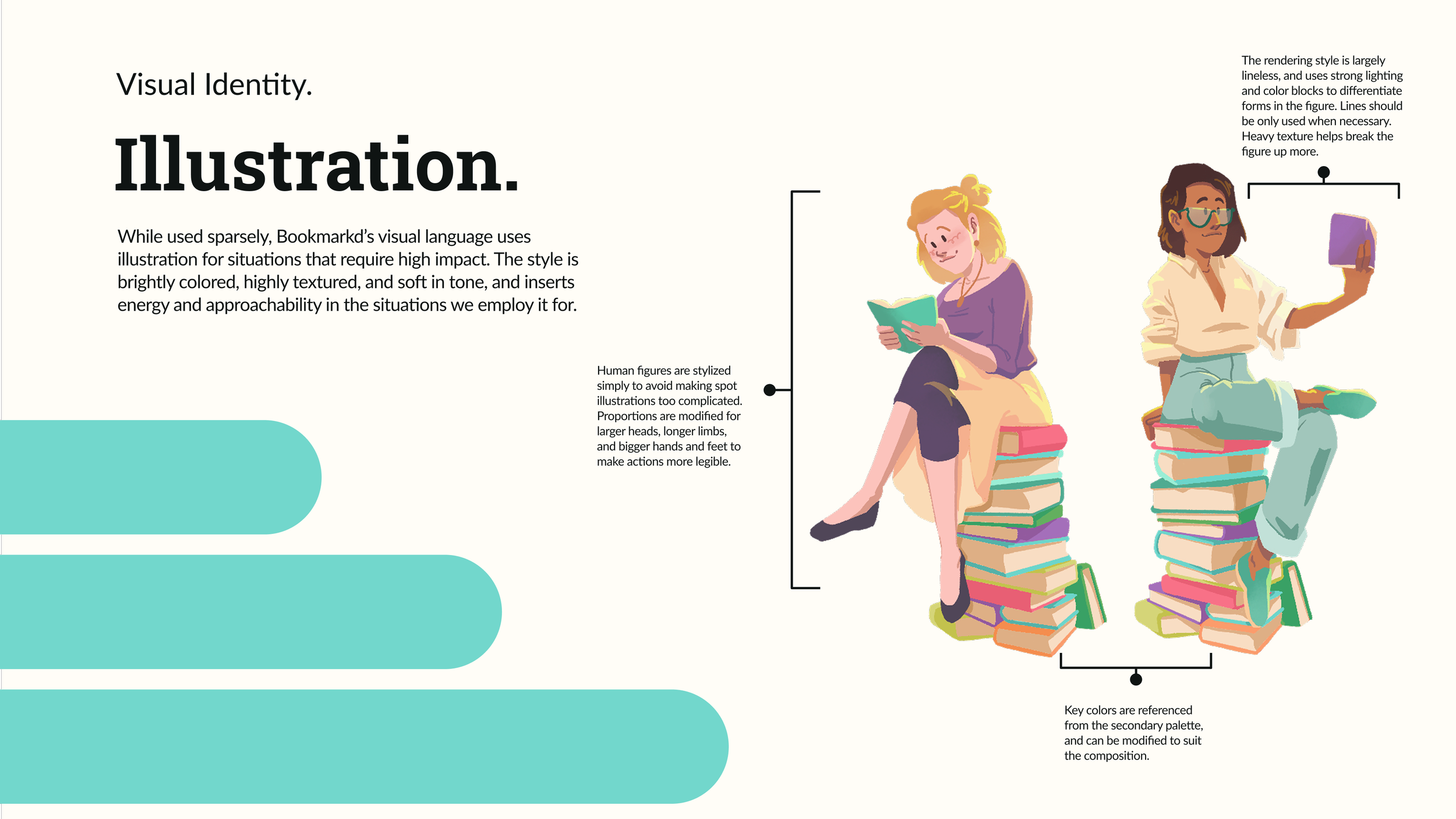
Below: select pages from the Bookmarkd brand standards book.


Glorp’s Diner


Left: the original Glorp meme. Right: initial concept art of Glorp as a plush toy, before we decided on his role as a mascot.

I was recruited to this project for my illustrative and concept art skills, which was only pitched to me under the name: Glorp’s Diner. Upon research, the team discovered that ‘Glorp’ was the name of a series of memes of a small kitten edited to look like an alien. We took that and ran with it, creating a themed diner in the style of restaurants at Meow Wolf or Disney facilities with a cute alien kitten as its mascot. This was a fantastic exercise in both branding for family-friendly applications, and into theme park and experience design.
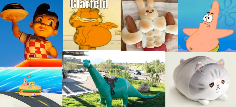
Moodboard for mascot creation, including Big Boy, Patrick Star, and the Sinclair Dinosaur.


Left: in progress and final rendering of the interior of Glorp’s Diner. Right: moodboards for diner concept art,
including TV show Twin Peaks, Edward Hopper’s Nighthawks, and Disney theme park concept art.

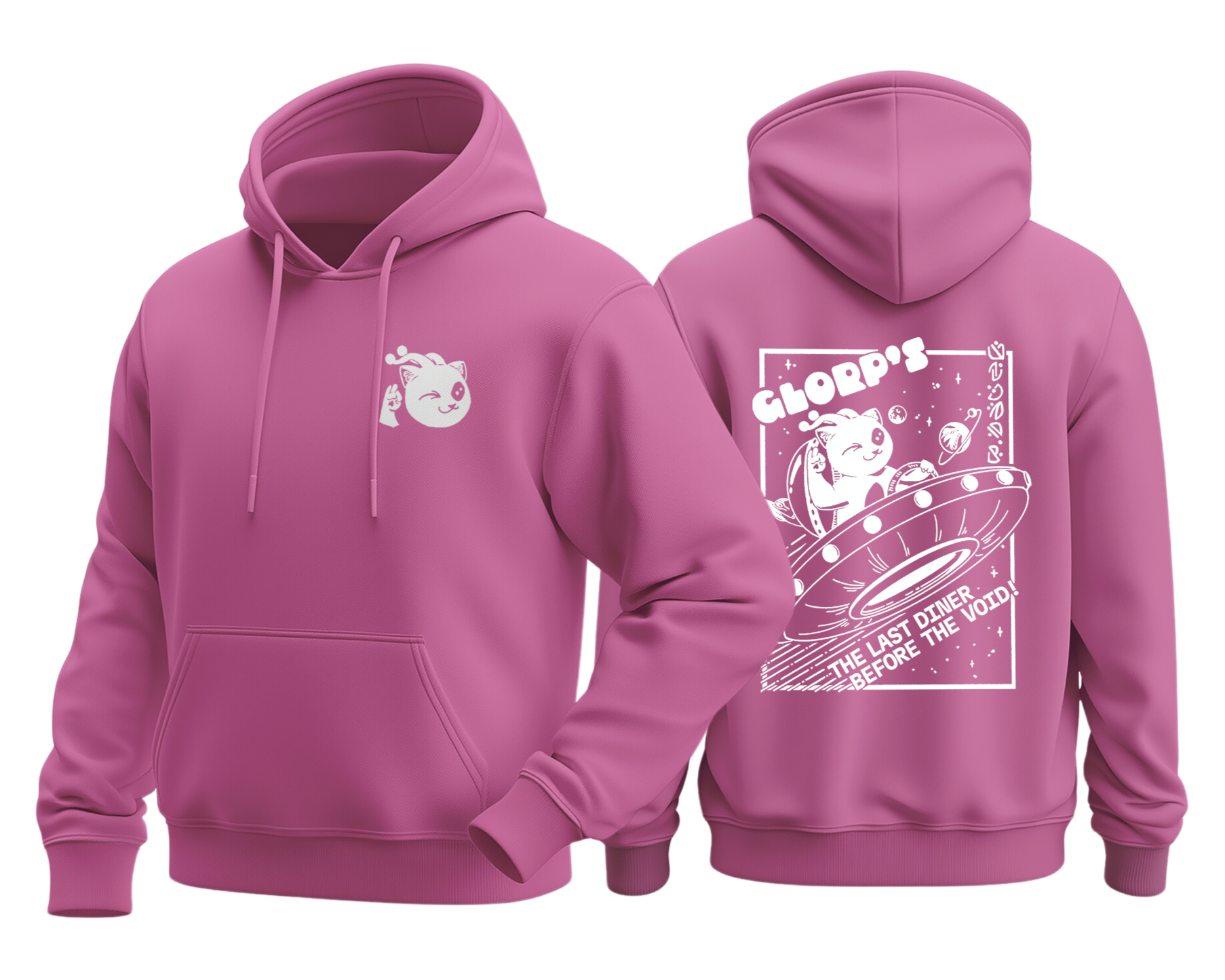
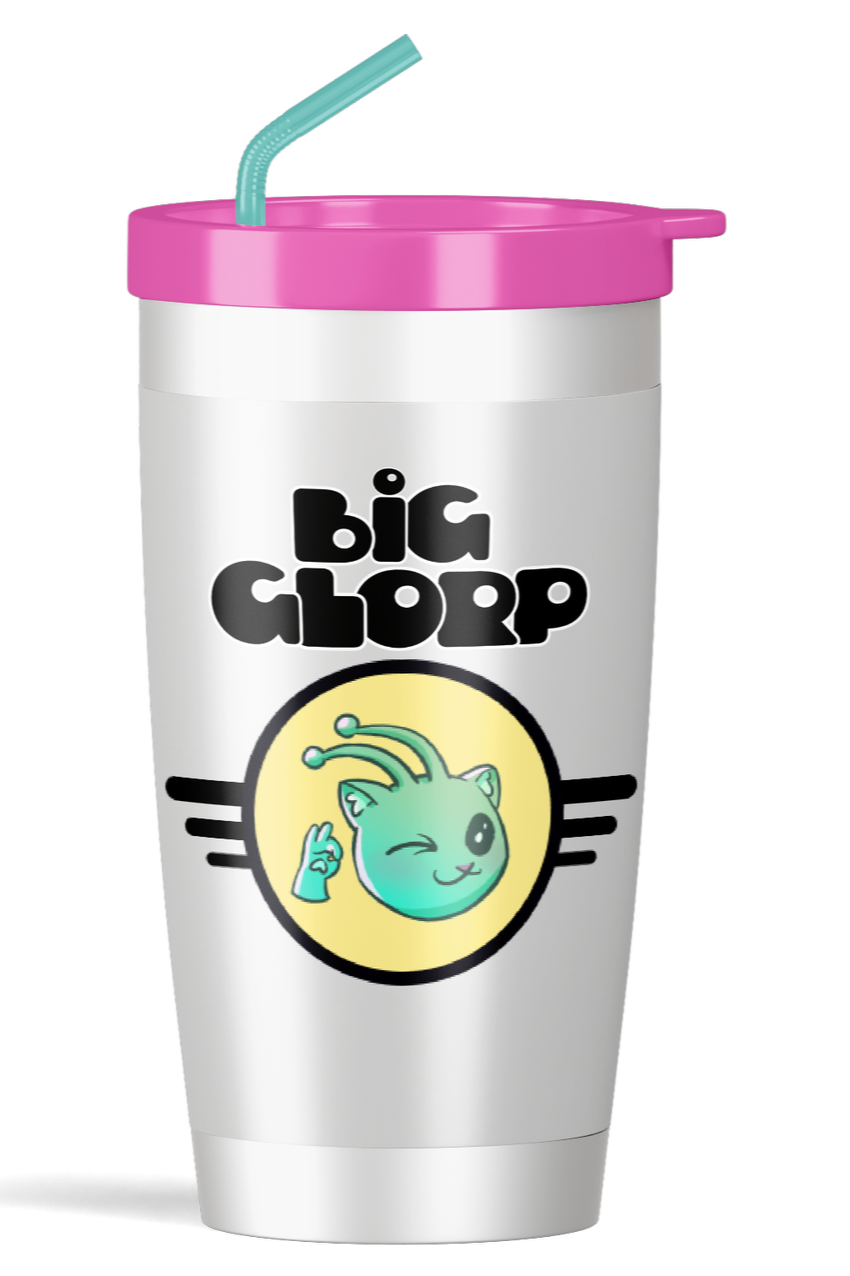
Glorp’s branded merchandise: Glorp’s hoodie, ‘Big Glorp’ travel tumbler, and Glorp’s mugs.


Vital Planet
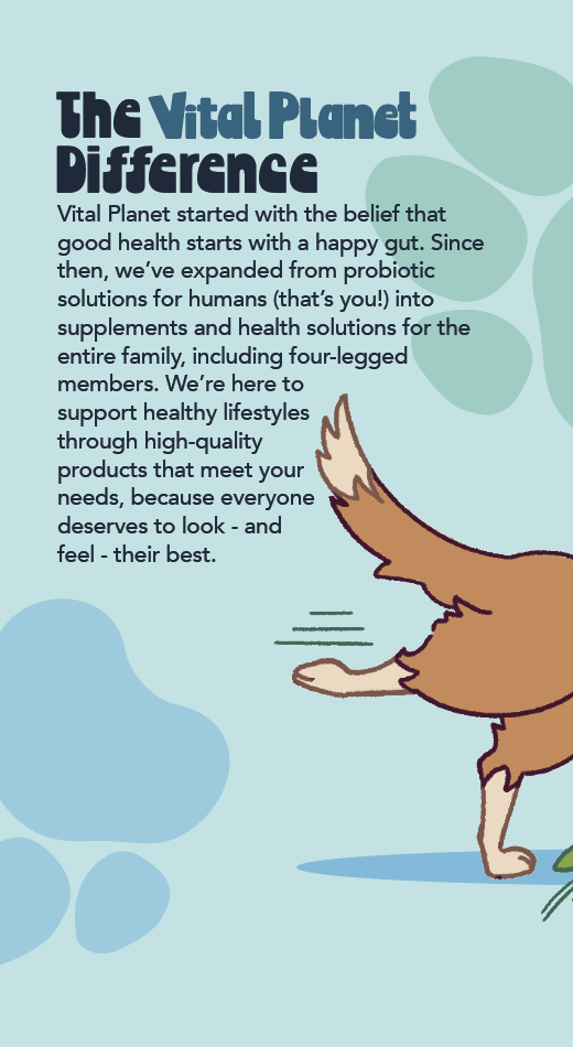
Vital Planet is a supplement manufacturer that recently branched into pet care; with a day job in pet supply, I found myself needing to overcome the stiff and ineffective packaging to sell this as a high-quality product. In response to this, my sales contact suggested that I redesign some of the packaging to better respond to modern branding trends that I’ve personally observed, including the use of pastels and brights, energetic and unique typefaces, and cartooned or lineless imagery.

Current packaging, as of Q1 2026.
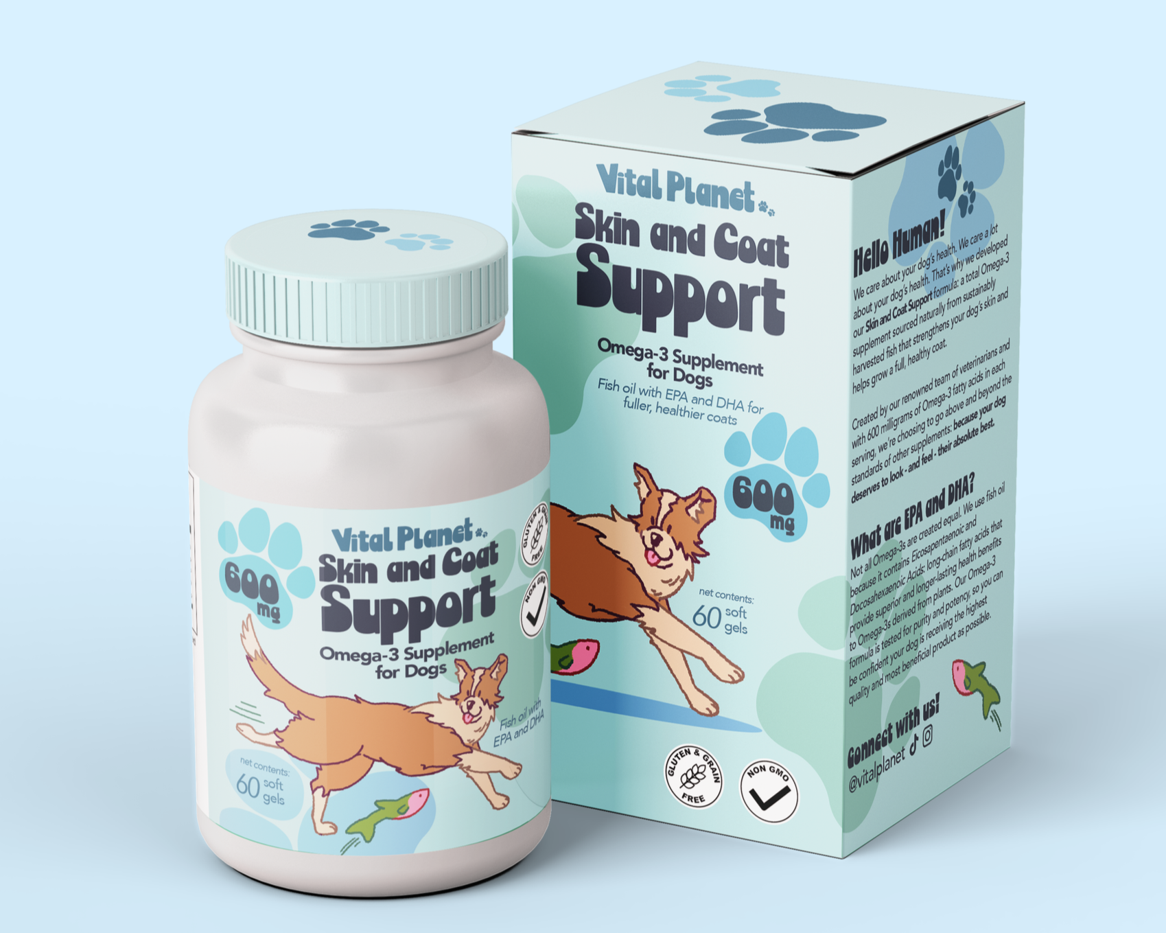
Mockup of redesigned pill bottle and box packaging.

Above: box dieline. Above right: Bottle label.
Right: box panel copy details.
Below: additional dog illustrations
for future box designs.


SMART
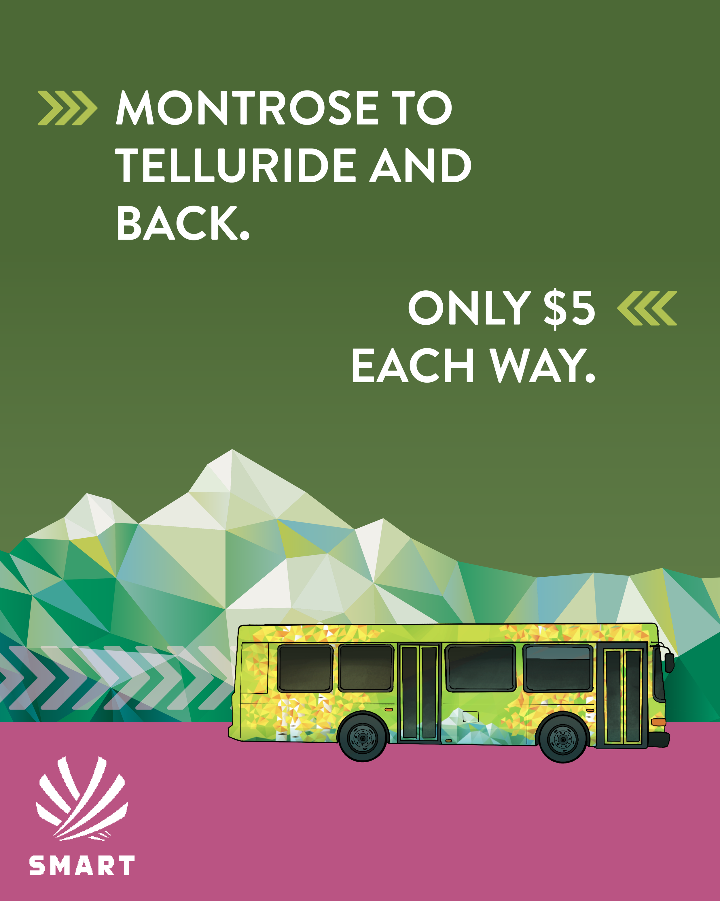
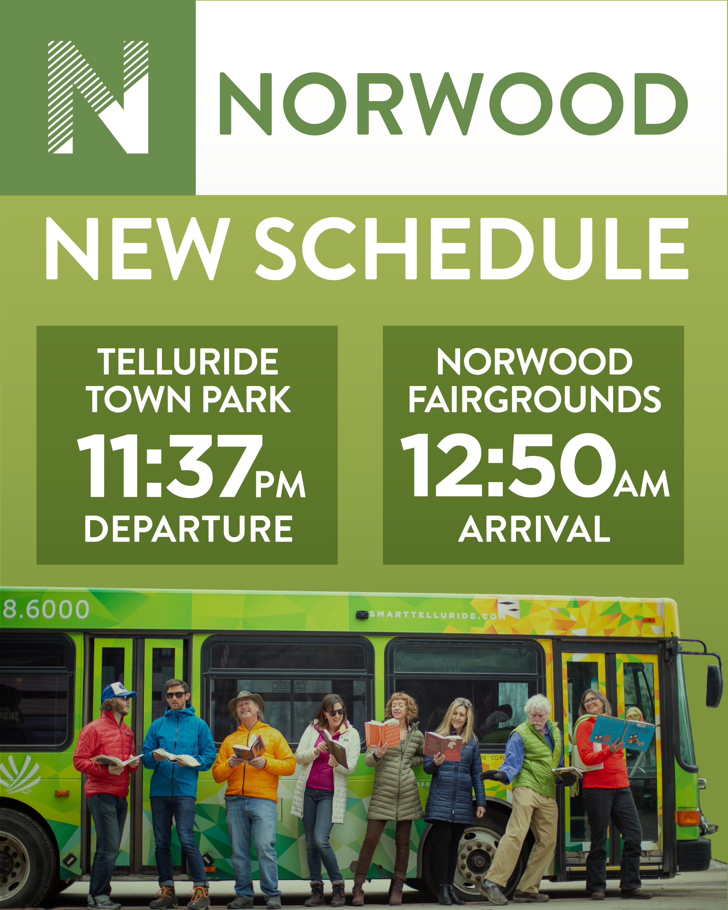
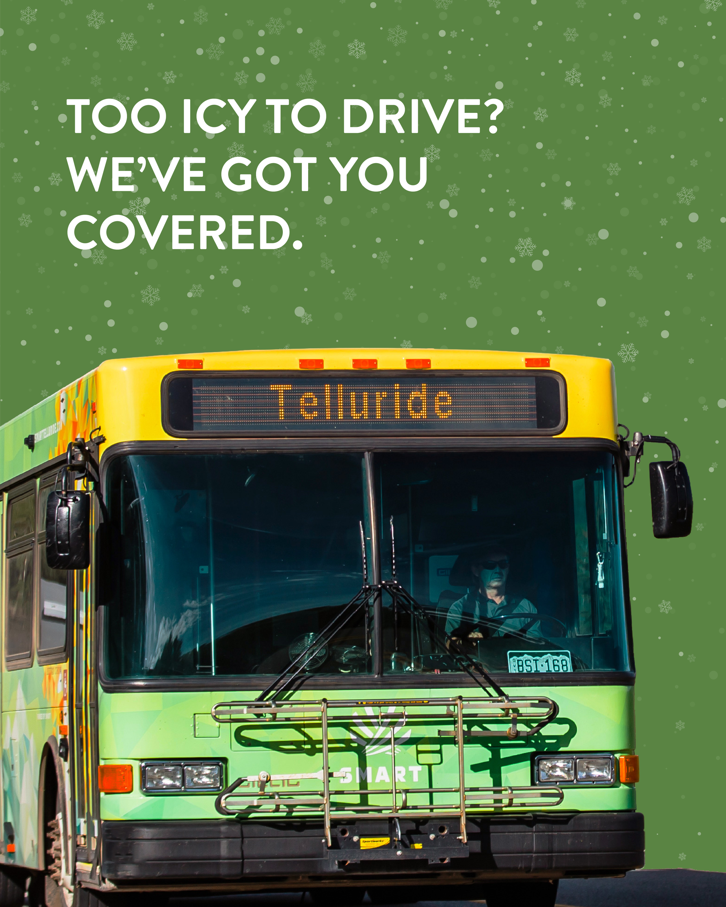
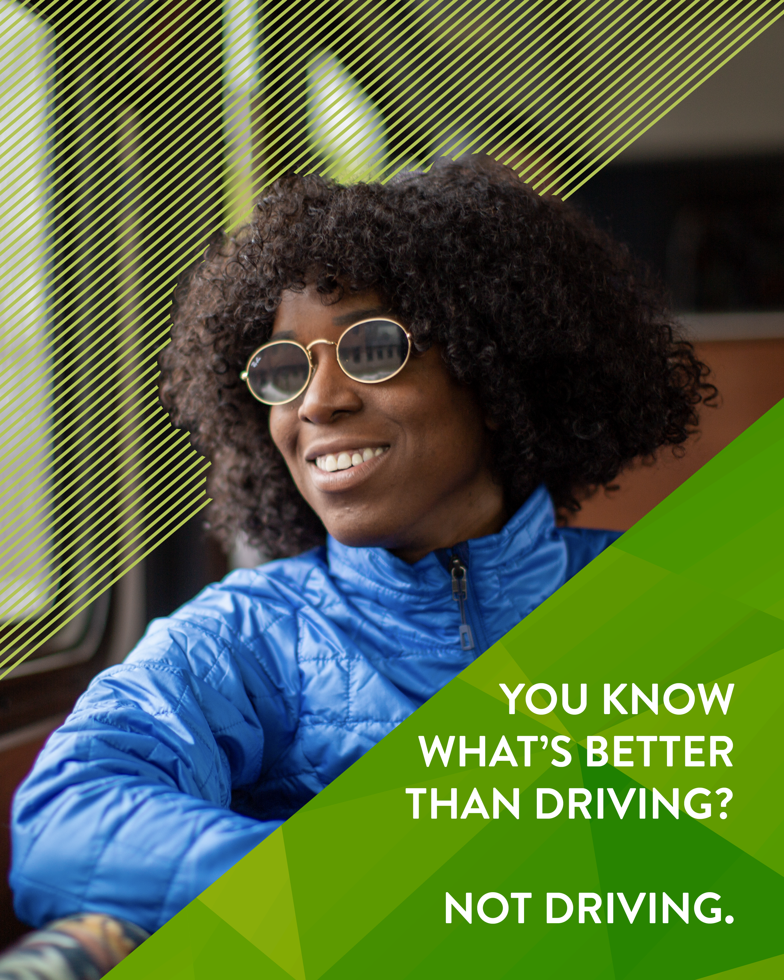
While working with Studio Six Branding, I designed social media posts for one of our regular clients, SMART (San Miguel Authority for Regional Transportation), a regional bus system in San Miguel County, CO, that mostly serves workers commuting into the county seat and ski destination of Telluride. SMART’s branding emphasizes safety and economic values to reflect their ridership, which I often imbued with a playful feel to give the posts life and encourage engagement.
Left: selection of planned posts for the
official SMART Instagram account.
Above: vertical promotional video for SMART’s
Instagram story and Instagram Reels page.


Key promotional image for rebrand.
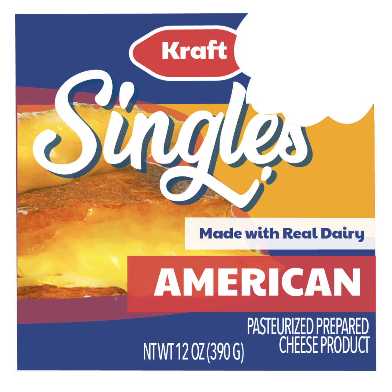
Kraft Singles
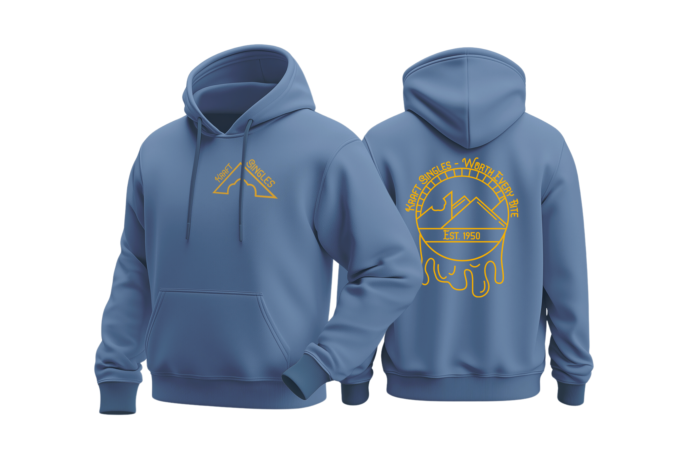
I chose to rebrand Kraft Singles as part of a ‘brand rehab’ project in a graduate-level branding design class. I looked to fashion-forward food and beverage brands like Arizona Tea for inspiration to rebrand Kraft Singles as playful, trendy, and energetic with an offbeat sense of humor, and a bite-mark motif to tie the whole thing together.
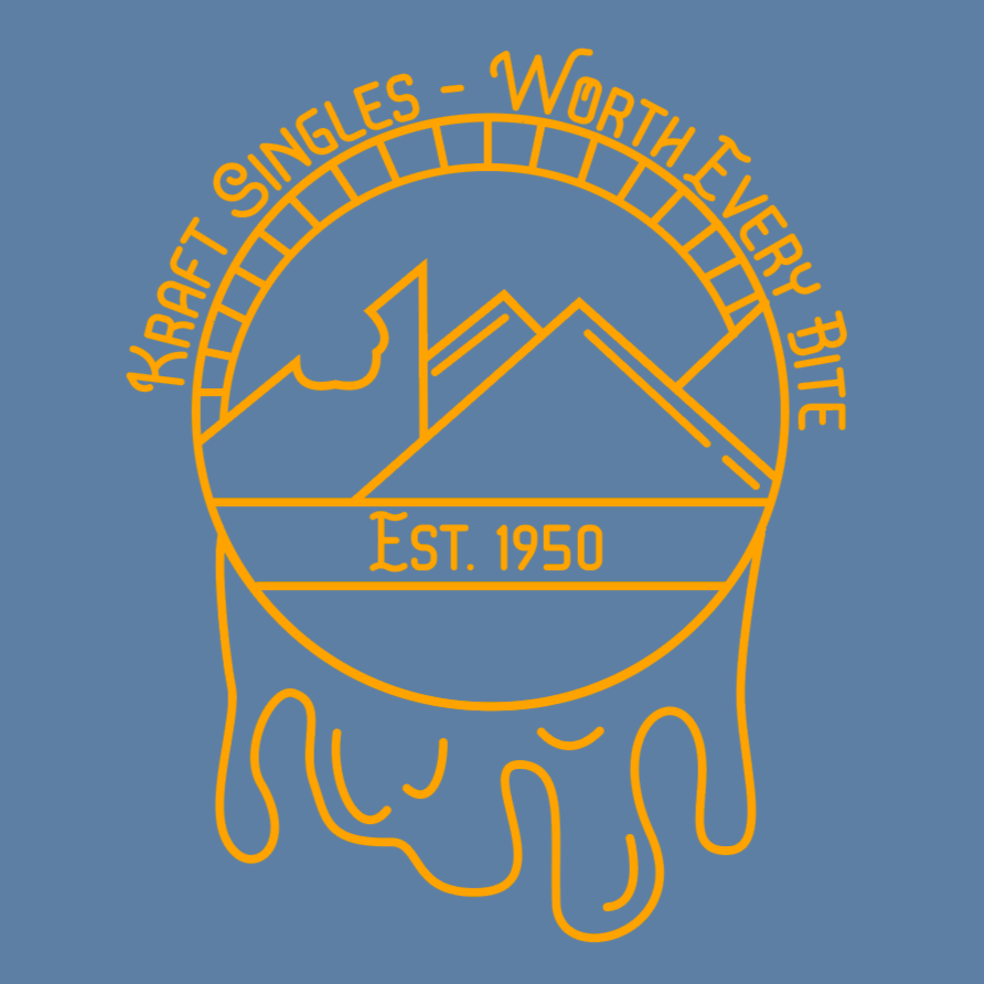

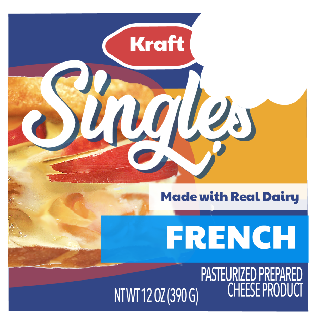
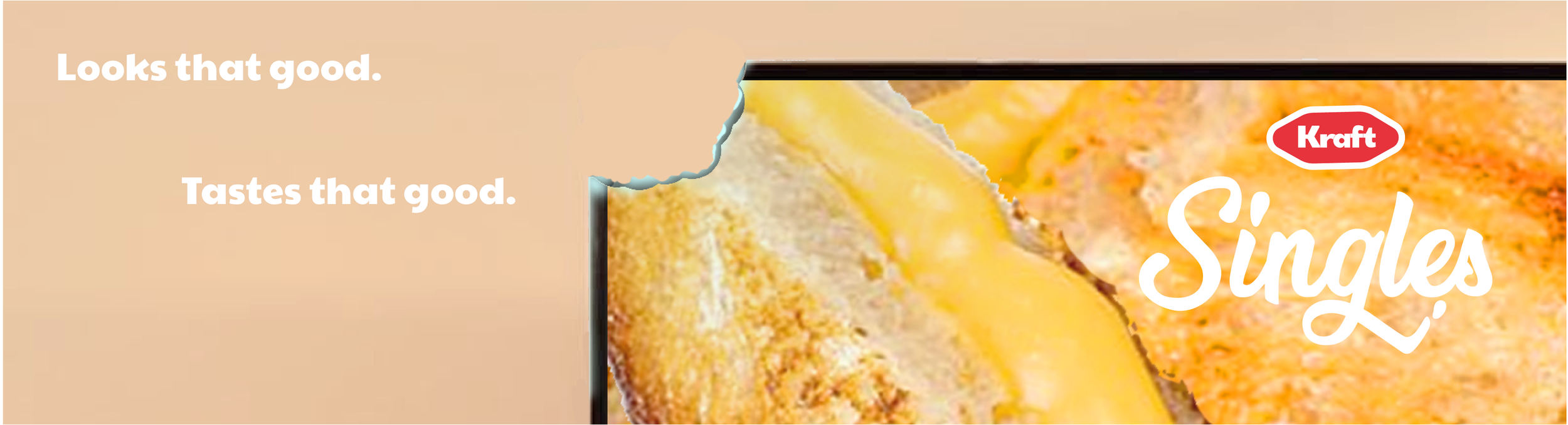
Clockwise from top left: hoodie mockup and detail of back panel design; advertisement for magazine spreads and web pop-ups; advertisement for web banners; front panels of new packaging, including new “French” line, made with Gruyere instead of Cheddar.
Concept diagram of packaging.

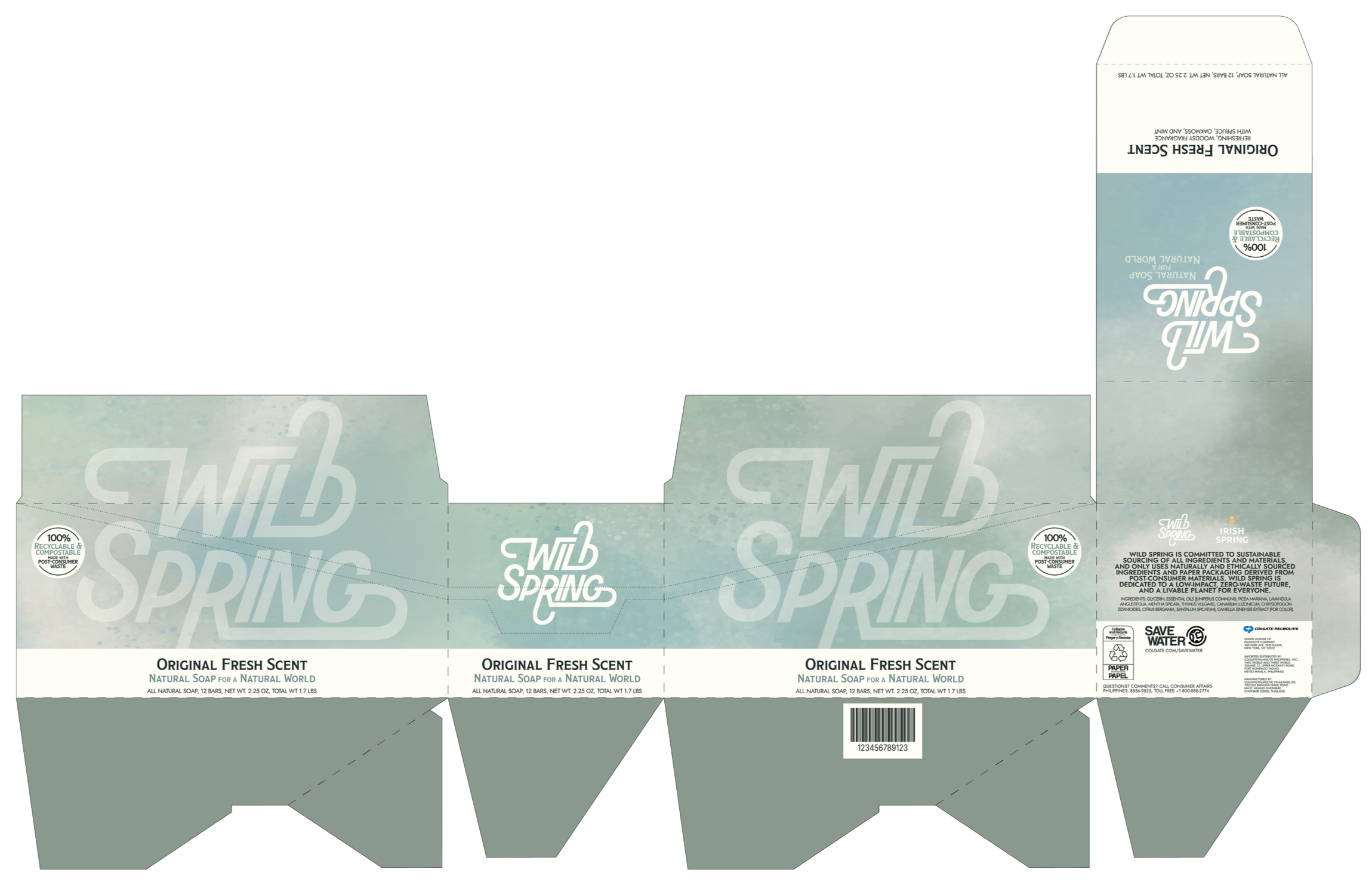
Above: in-class demonstration of packaging, including real soap to show weight support.
Right: slip label for soap bars and
dieline for packaging box.
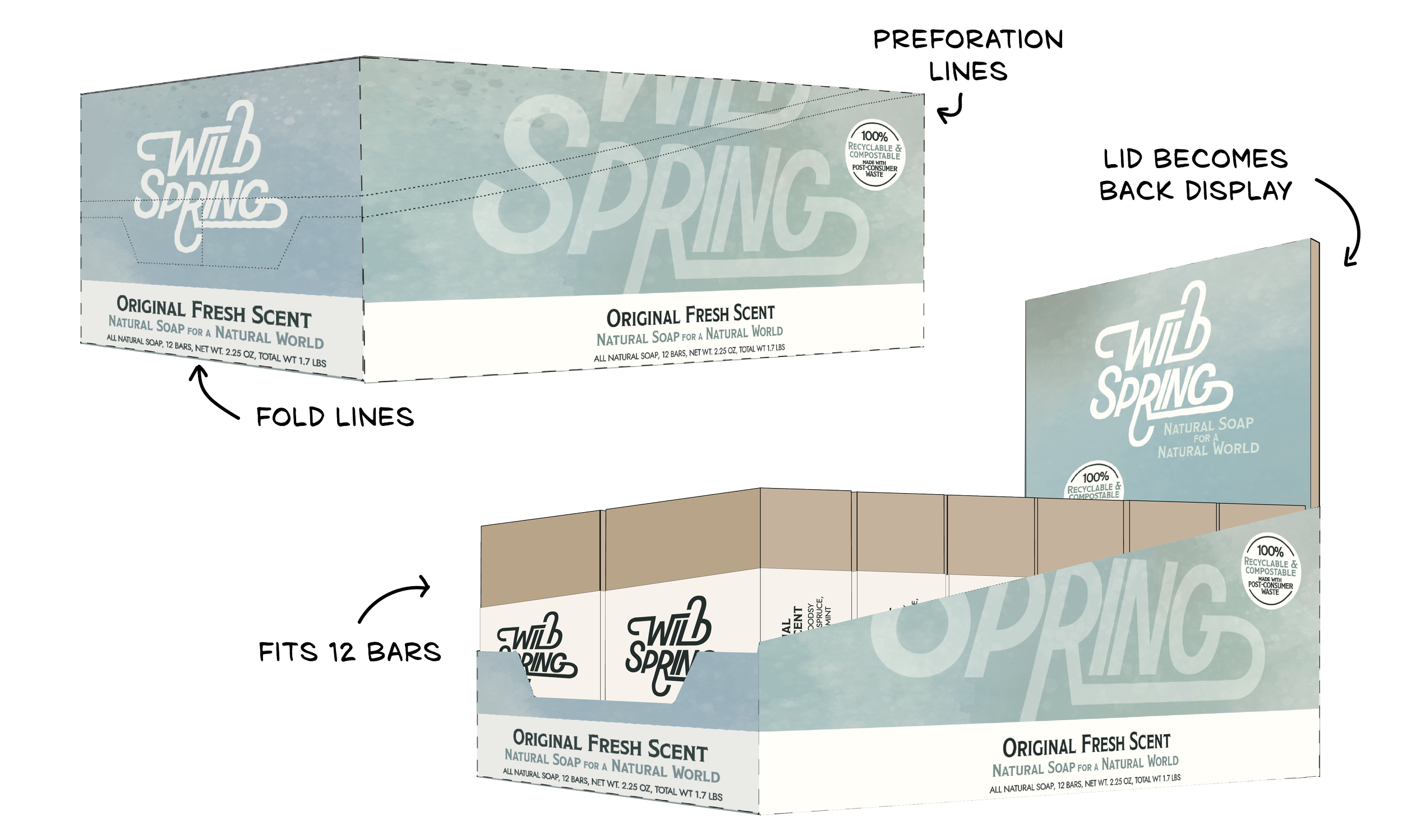
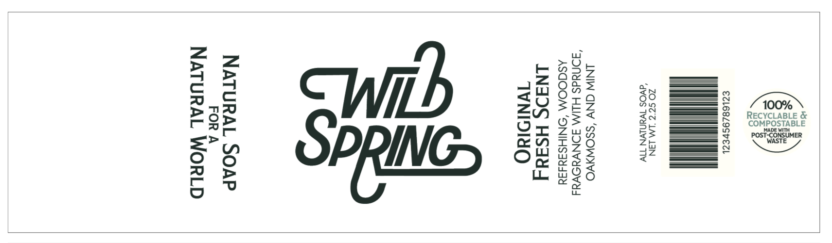
Wild Spring
For a course on designing for sustainability, I teamed up with a few classmates to pitch an eco-friendly sub-brand of the soap manufacturer Irish Spring. As the packaging design lead, I prioritized minimal waste, sourcing low-carbon materials for hypothetical manufacture, using a box design shape that would support the heavy soap with minimal aid of adhesives, and taking advantage of the packaging itself to make it double as a display card for shelves.

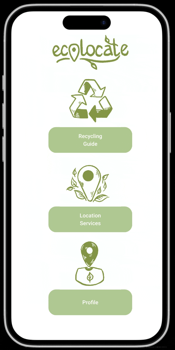
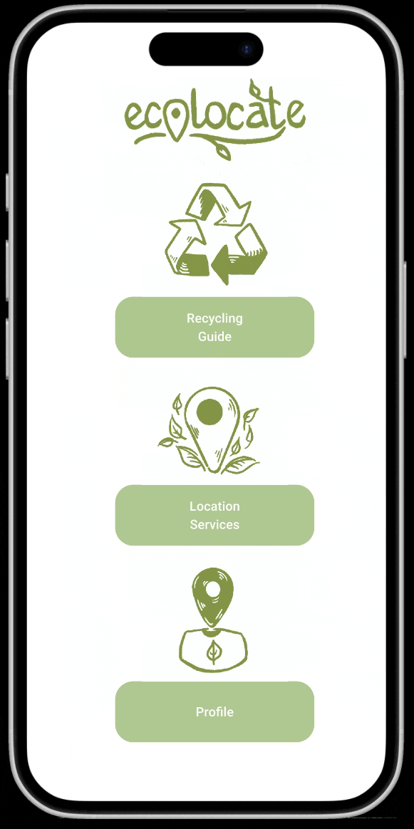
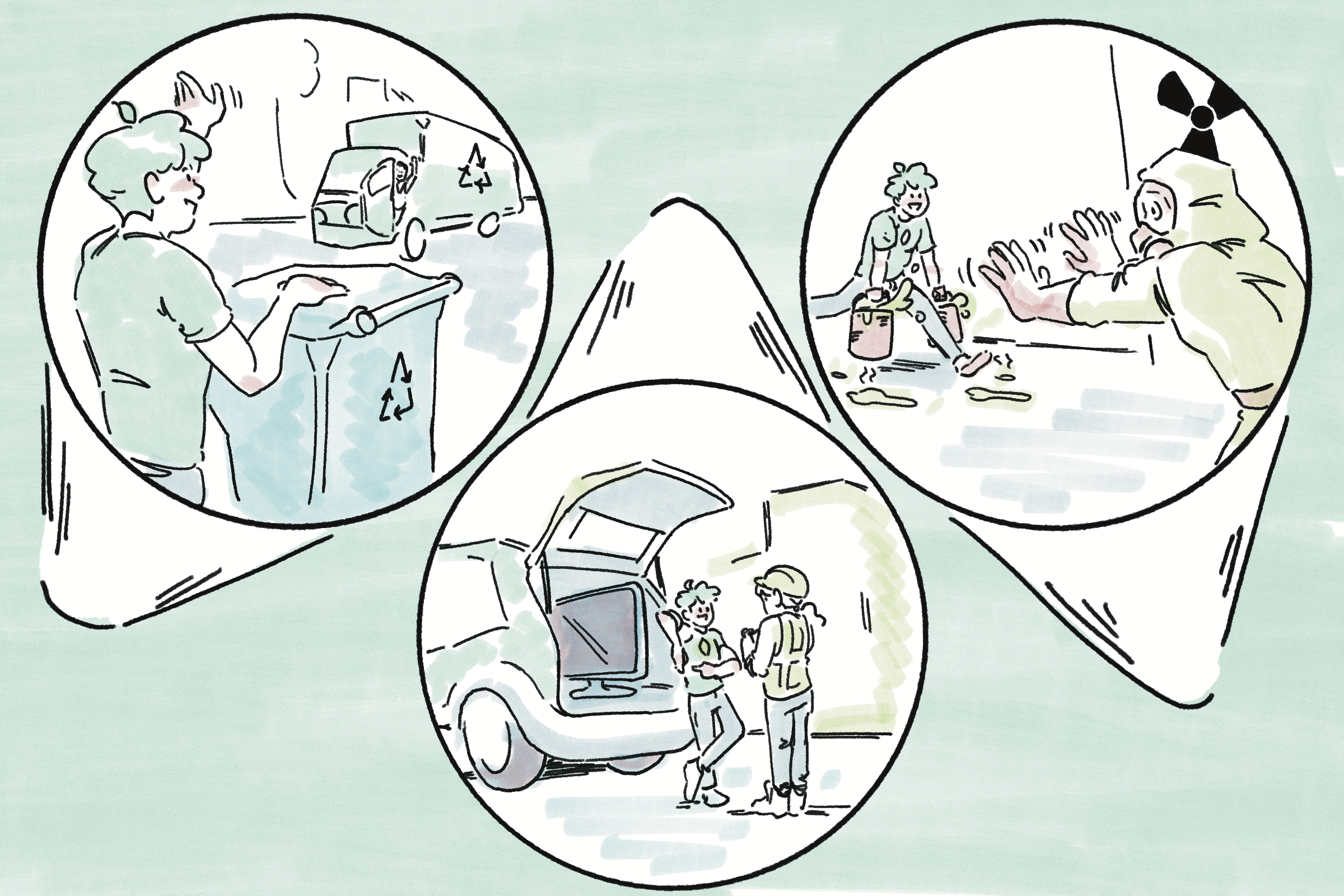
Above: demonstrations of the Ecolocate app prototype.
Right: icons representing compost, paper products,
and unrecyclable trash.
Ecolocate
I’m incredibly passionate about sustainability and the environment, and noticed that many of my classmates at CU Boulder were not aware of the robust recycling facilities and strong reuse culture in the city. This inspired me to create Ecolocate: an app that identifies the recyclability of a material and connects users to local recycling centers for proper disposal, while also educating the user about the realities of recycling today and encouraging material reduction and reuse.

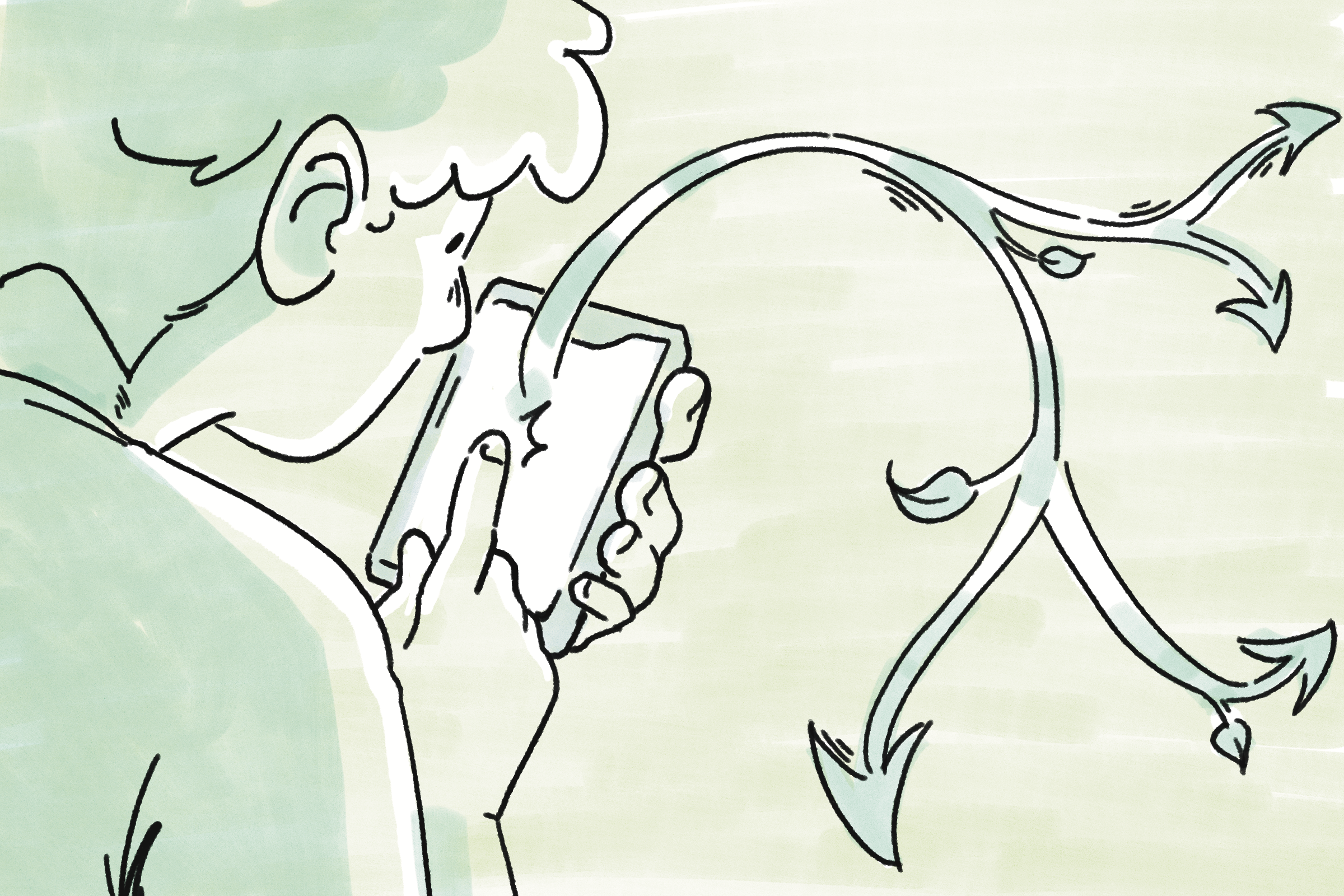

Storyboards for final pitch presentation, dramatizing app usage for the audience.
Above: final poster design, front and back.
Below: graphic of poster folding method, and
visible panels when folded.
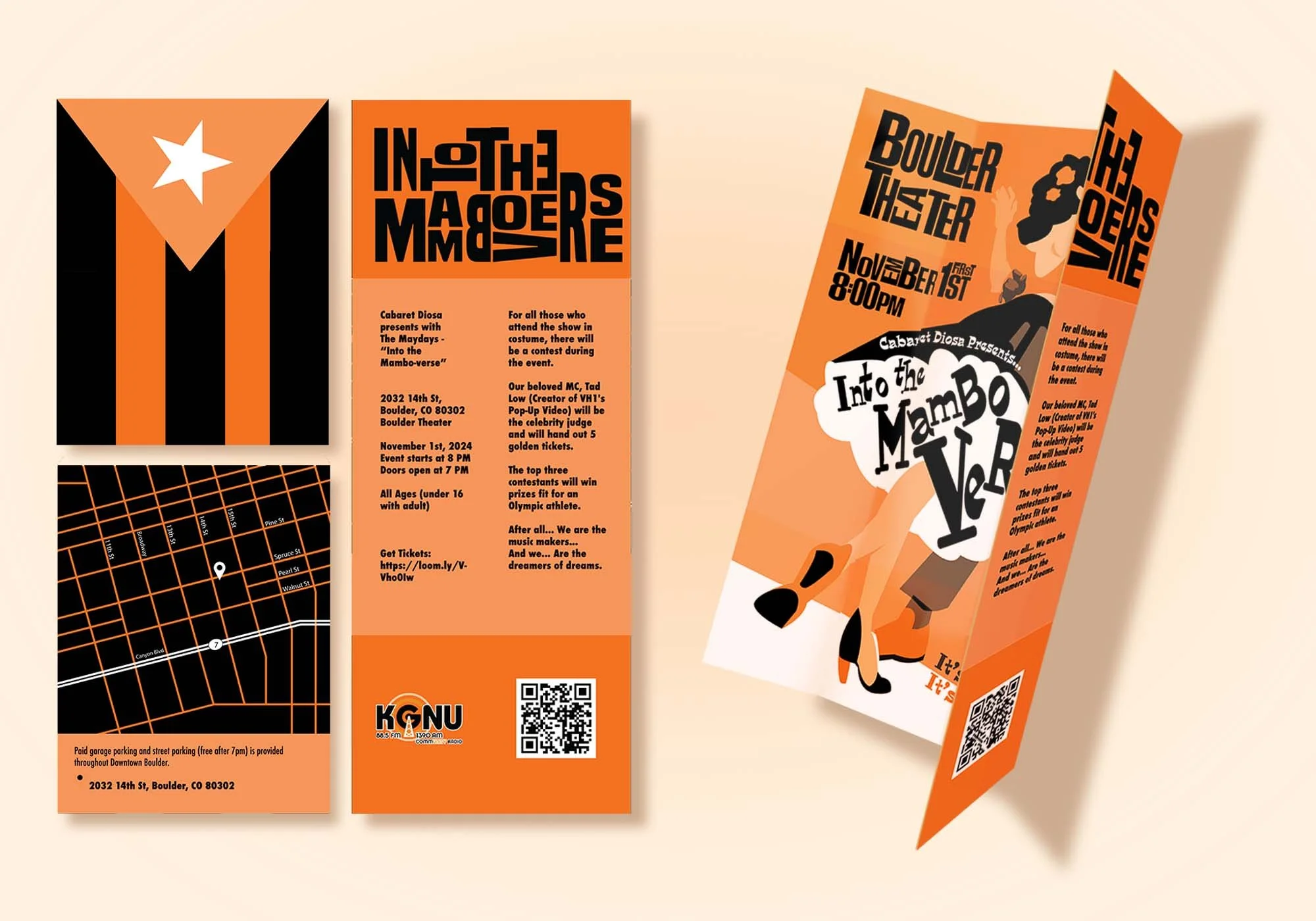
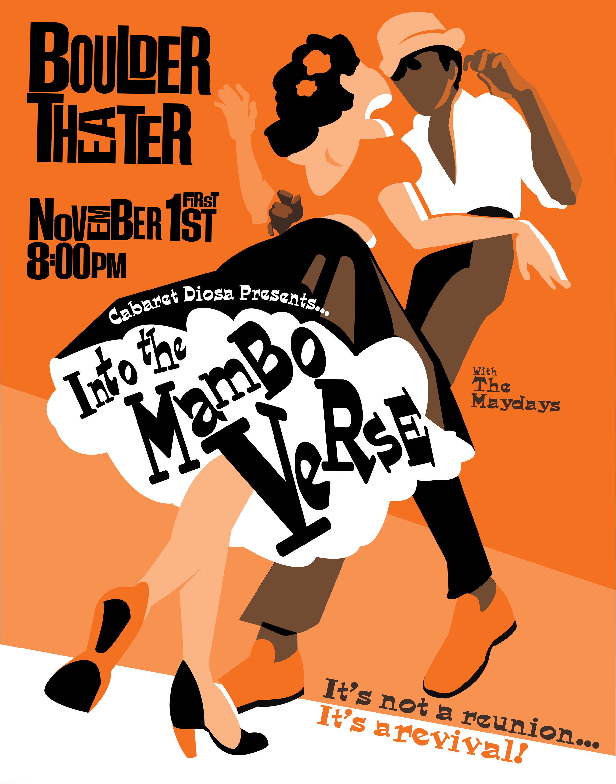
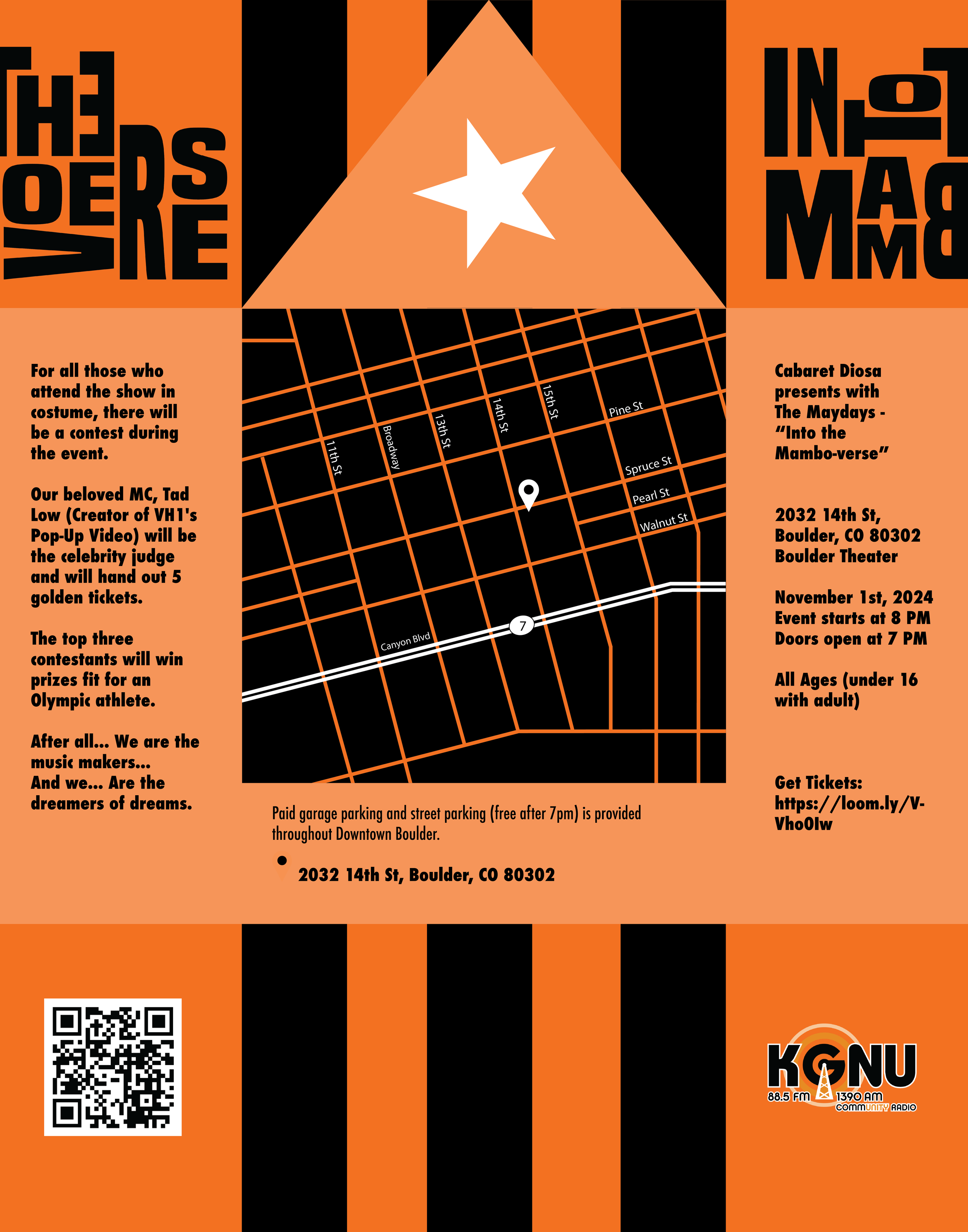
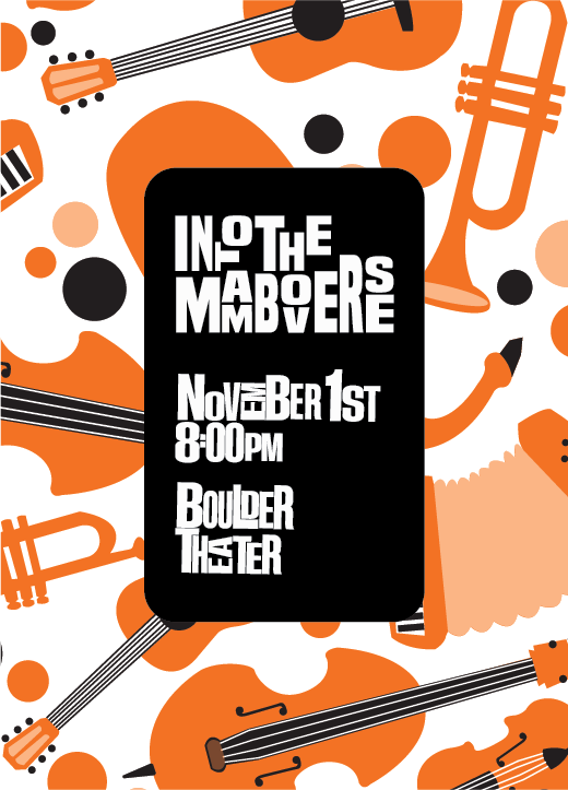
Into the Mamboverse
Cabaret Diosa is a Mambo orchestral band local to the Boulder area; my collaborator on this project and I approached the band to design promotional material for their first live show in nearly a decade. Inspired by Mambo’s Cuban roots and connected dance tradition, we designed this dancing pair as the main motif of the whole project, with the band’s instruments as a secondary motif. The poster is interactive as well as displayable, and folds into a neat little square for safekeeping during the performance.
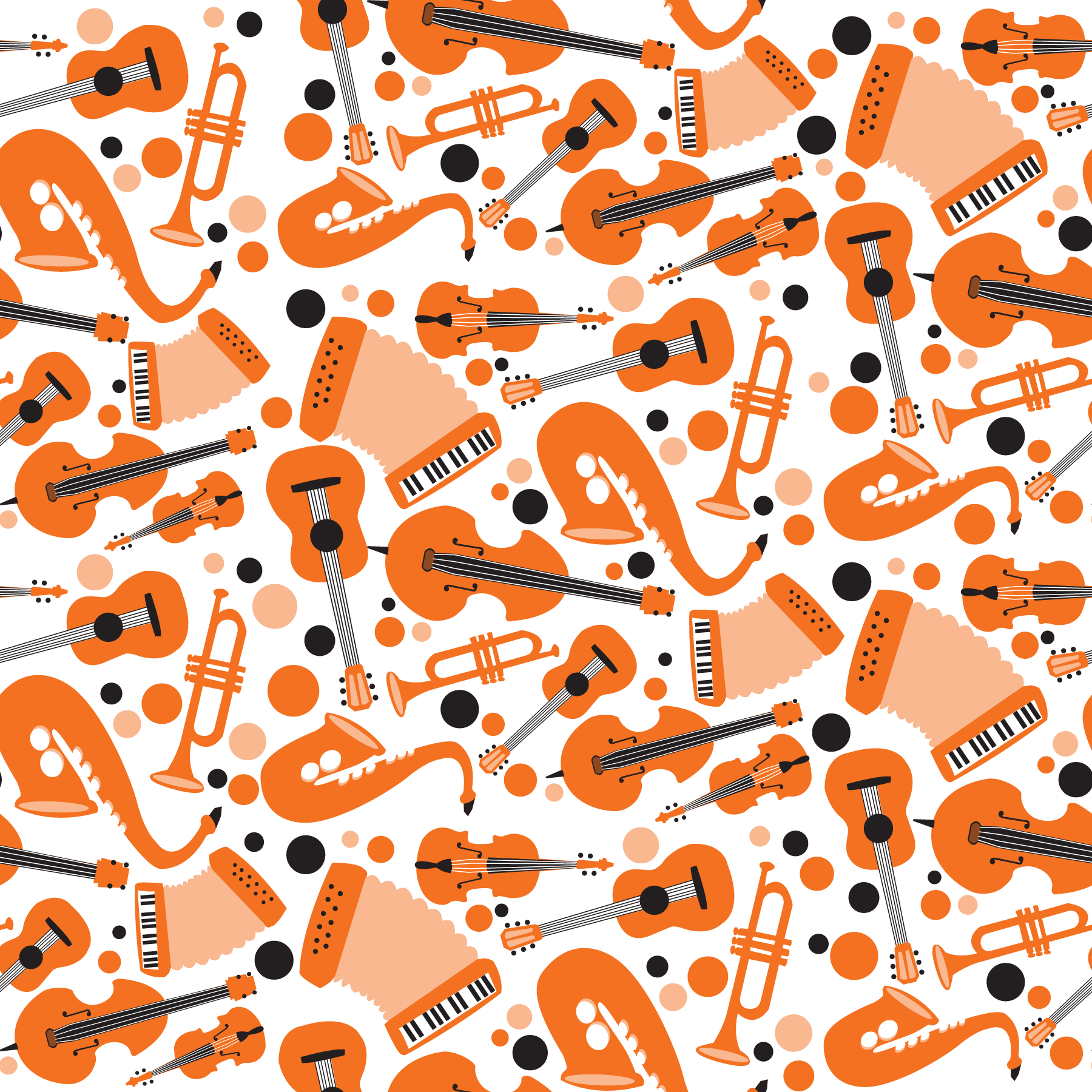
Above, left to right: repeating pattern of instruments played by client Cabaret Diosa; additional promotional postcard using the repeating pattern; animated version of dancer motif for promotion on Cabaret Diosa’s Instagram story.
Rollin Greens

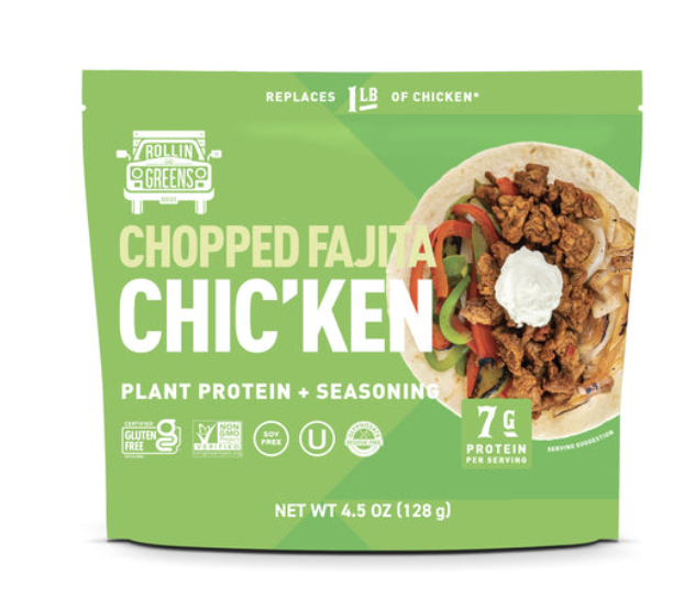
Above: original packaging for Rollin
Greens’ taco and fajita products.
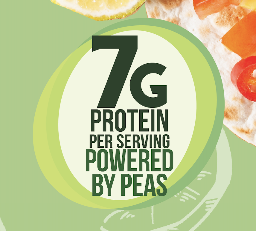
Below: notable details from suggested packaging redesign, including two new taglines.
Rollin Greens is the manufacturer of a pea protein-based meal substitute for family dinners like tacos, fajitas, and whatever other vegan meals you might come up with. My classmate and I were paired with Rollin Greens as part of a graduate-level course at CU Boulder about designing for corporate scale, and I took over the role of Creative Design Lead, synthesizing my partner’s market research findings into a packaging redesign with more clarity, repeated usability, and consumer appeal.


New packaging design in resealable pouches.


Pouch dielines for new packaging.
Promotional clip for Weave.
Weave was an exercise in creating a brand and a product simultaneously under a strict three-week deadline. Inspired by online fandom use of platforms like Pinterest and 8Tracks to make themed moodboards and playlists, I bridged these two concepts into one product: a music sharing platform geared towards telling audio-visual narratives, for creatives and weirdos of all ages to share their original and fan works with each other.
Early moodboard and logo ideation/animation for Weave.
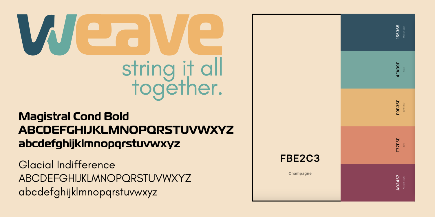
Final logo and tagline, typeface choices, color palette, and animated logo for Weave.
Prototype footage of the playlist loading function.
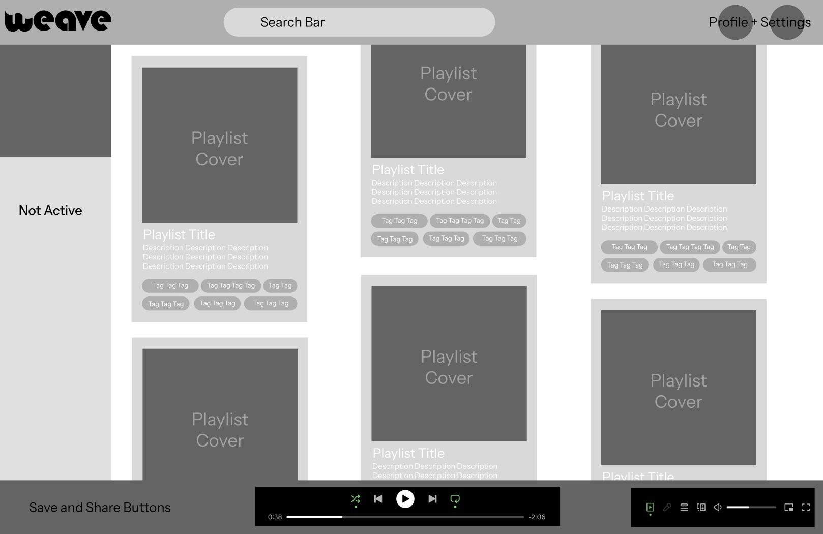
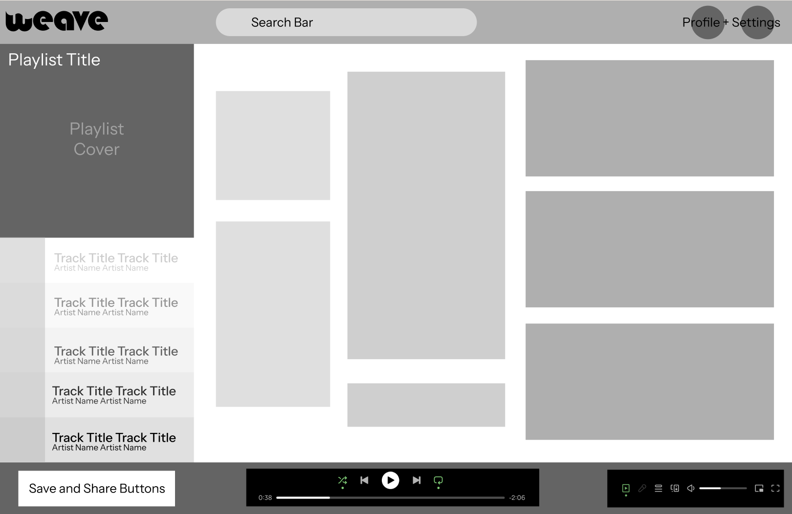
Initial wireframes for search results and playlist presentation.